Comix
Nineties flashback
XKCD is commorating the shutting down of Geocities. Everything is 1996 again.
George Tuska
Just before the weekend George Tuska died. Tuska was one of those comic book artists (like Don Heck, Herb Trimbe, Vinnie Colleta, even Gene Colan at times) who are only known to several generations of comic book readers as disappointing fill-in artists, ill-served as they were by having to survive in an industry where comics books were made like saugages, the artists as interchangable as workers on an assembly line — who cared if it was good, as long as it was fast. So I only knew Tuska from his (increasingly rare) fill-in work in the eighties and seventies, which wasn’t that good but still offered glimpses of his real capabilities.
Tuska started in comics back in the early forties, at a time when the highest aspiration a cartoonist could have was to have his own newspaper strip. He never managed that, but he did have long stints on two classics, Buck Rogers and Scorchy Smith. He also did a lot of work for the various comics sweatshops that were then operating, including for Will Eisner. During the sixties he was one of Marvel’s second bananas (as compared to legends like Ditko and Kirby, his longest work being on Iron Man, on which he had a ten year run from ’68 to ’78. He also worked on various Bronze Age titles like Ghostrider,
It’s unclear if perhaps Tuska suffered a bit in terms of overall ease making the transition from strips back into comic books, and whether he felt entirely comfortable working under the basic model established by Jack Kirby: his layouts were certainly more imaginative than the standard at the time, and the way in which characters like Luke Cage held a lot of their strength in their shoulders and punched from their legs up through their torsos betrayed his knowledge of strength and fitness. His signature flourish may have been characters in arrested motion, coiled in preparation for violence like so many pulp heroes of an earlier generation, legs splayed in the form of a near-base ready for what might come next. While perhaps slightly diminished in otherworldly power that many comics artists milked from the contrast of stillness and exaggerated movement, Tuska’s heroes almost certainly suffered fewer muscle pulls.

That’s what I remember as well of Tuska, the way his characters stood and moved — you could always tell when Tuska did the art just by that, just like you could with Jack Kirby or Gil Kane. The art above is a good example. Both figures are slightly off centre, Iron Man leaning forward, with Kang leaning backward, one arm outstretched, the other held back for immediate action, both figures balanced on their feet, ready to move if necessary. Though static, there’s a feeling of suppressed movement there, even with the empty background. As Tom Spurgeon says, it shows a knowledge of how real people move, looks far more realistic than a similar Kirby pose, more raw than how Gil Kane would show this scene. That’s what made Tuska’s art always recognisable, no matter how hurried it was.
Sequential Sunday – storytelling techniques
For some reason I was quite taken by this short comic, linked to from Journalista. It’s no more than a simple, short anecdote, but this simplicity makes it easy to see the form in which the story is told, the choices the writer and artist have made — consciously or unconsciously — to tell it. As Scott McCloud made clear in Understanding Comics and its sequels, this is an intricate yet easily overlooked craft. Until it’s laid bare for you like it was with me in this comic, you do not realise how much thought goes into these storytelling basics.
I hadn’t heard of either the writer, Jonathan Baylis, or the artist, Tim E. Ogline, before and I’m not sure what audience they had in mind for this comic. From evidence at the website it seems this is one in a series of comics done by Baylis, with different artists, all semi-autobiographical and starting with the word “so”. The style of the artists of the samples available is variable, so I think most of the credit for the presentation has to go to the artist, Tim Ogline.
It’s easy to forget if you’ve been reading them your whole life, but you need to learn how to read comics, how to interpret and order a sequence of images on a page; how an artist lays out the pages and tells the story can help or hinder this process. Tim Ogline’s choices here all seem designed to make the story easy to follow even for a non-comics reading audience. Some of his choices reflect what Bryan Talbot did for his Tale of one Bad Rat, one example of a comic deliberately designed to be readable by people unfamiliar with comics.
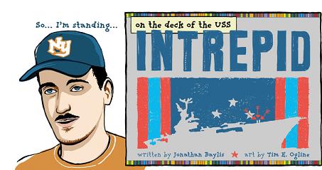
Intrepid is only eight pages long, the first four pages providing the context for the heart of it, a two page flashback, followed by another two pages of wrapup. In it Jonathan Bayliss tells of how he went and visited the museum ship USS Intrepid with his uncle, who served on it during the Vietnam war, and how this visit triggered his uncle to talk about the day he lost his best friend there. It’s told as if Jonathan is sitting across from you in the pub telling it to you, as emphasised by the very first panel, just a head and shoulders shot of him, against an empty background, next to the credits. This headshot returns several times, each time with a simple coloured background, as a sort of guide.
The panel placement is interesting. On most pages they’re laid out in three rows, in a mixture of full length “establishing shots” and rows of two square or rectangular half length panels. But when the story comes to the moment of crisis the horizontal rows are replaced with narrow, angular panels, laid out in two rows of three columns, while the “camera” steadily moves inwards, closing up on the uncle’s face as he remembers. Since this takes place while the narrator and his uncle go down a stairwell into the bowels of the ship, the panel layout emphasises the claustrophobic, cramped feel of this. The layout is mirrored on the seventh page, after the flashback, when the “camera” moves outward again as they move back up.
When we enter his flashback we are back to the normal layout, but on the sixth page, the death of his friend is shown in four full length horizontal panels. Both choices slow down time, reinforced by the almost static images in the panel, but in the second sequence you also get an impression of the speed with which the accident happened.
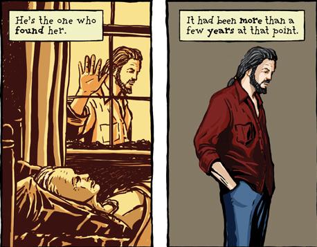
As the above image shows, Ogline represents flashbacks by way of a yellow-sepia background, then carries the feeling of the flashback over into the present by the character’s stance, repeated again on the following page, as well as, more symbolically and in silhouette after the main flashback sequence. This use of colour makes the flashbacks immediately identifyable and make it easier to understand them. Colour also plays a role in emphasising mood, getting darker leading up to the flashback, while the resolution is presented in bright, clean colours.
Ogline’s drawing style in general is somewhat streamlined, if you can call it that. His people have faces that show personality enough for you to realise that they’re modeled on real persons, but which are far less detailed than his backgrounds. Interestingly, in the flashback, there is much less detail shown, the planes more sketched than drawn, which again helps establish that these are memories.
To recap then, what makes this comic accesible to new readers are several techniques. First, the panel and page layout is kept deliberately simple, moving from top to bottom, right to left in predictable patterns, but with the panel shapes changed to emphasise mood. Second, there’s the use of colour to create a distinctive look for the flashbacks, as well as to once again emphasise mood and place. Third, there are the repetitive elements: the narrator’s headshot, the way the uncle stands, to guide the reader through the story. Finally, there’s the artist’s drawing style which keeps a fine balance between overwhelming realism and cartoon. These are all techniques used by all cartoonists at one time or another, on particular fine display here.
The Killing Joke
In retrospect, Dorian Wright doesn’t like The Killing Joke:
In the long run, it was probably a mistake. While it’s still a masterfully crafted story, and Brian Bolland’s art is exceptional, the overall trend towards “darkening” Batman did serious damage, I feel, to the character and the comics industry as a whole. It was an attempt to chase a post-adolescent audience’s brief, media-driven flirtation with comics, but it froze out younger and more casual audiences. The audiences comics really needed to grow as a medium. It’s only lately, with the The Brave and The Bold cartoon and Grant Morrison’s Batman work, that a serious attempt to rehabilitate Batman from the brooding, angsty loner with mommy issues has been made.
Hear, hear.
Killing Joke always felt cynical to me, an attempt by Moore and DC to cash in on his surface reputation as a mature superhero writer, where mature equals R-rated sex and violence, for those readers who thought the nudity and brutality in Watchmen and Miracle Man were “deep” and missed anything more subtle. Even Moore at his most cynical offers glimmers of interest so it’s not completely bad, certainly not as bad as the glut of post-Watchmen, post-Dark Knight “mature” superhero titles that crowded the shelves in the late eighties/early nineties.
and yet it’s still awfully superficial and glib in its philisophy, the loveingly and lingering depiction of the the crippling and implied rape of Barbara “Batgirl” Gordon as a device to “break” Batman not that different from any such seen in a revenge movie like the “Deathwish” series, a device to propel the hero into action but only seen as an affront to the hero’s honour rather than as what it does to the victim, just a broken toy in this context. The ending where supposed hero and supposed villain meet in the middle and laugh it all off is annoying as well, as is its trite message, that all it can take is one bad day for a normal man to become a monster.
But the Bolland art is gorgeous.