There’s nothing I don’t like about Natalie Nourigat’s Don’t let fear stop you from traveling. The story, the message, done without preaching, the cute characters, the artwork. What I especially found impressive is how well it looks even on the small screen of my mobile phone, still easily readable (and loaded relatively quickly as well).
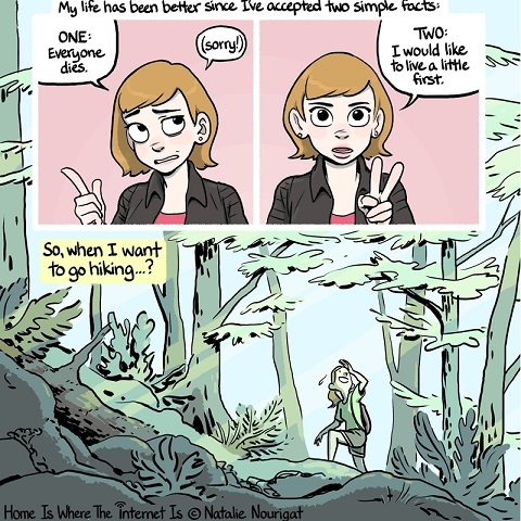
It’s interesting how text heavy this strip is. Nourigat makes full uses of captions, thought balloons and all the other comics paraphernalia the modern superhero strip has rejected as not serious enough. Yet here Nourigat tells the story mainly through captions, only occasionally talking directly through the reader, transitioning seamlessly between the two, as above. It’s a technique you see a lot in diary and non-fiction comics (Joe Sacco’s work e.g.). Done wrong, it can be stilted, unnatural and dull, but Nourigat makes it work, knowing when to use normal dialogue instead. You don’t normally notice lettering in comics, but there are a lot of regular comics that could use Nourigat’s lettering here as an example of how to do it well.
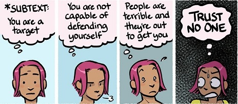
Nourigat’s artwork is clean with crisp, clear lines and an excellent use of colour, especially background colour. Whenever she’s able, Nourigat drops any background details from her panels, using single slabs of colour instead. this of course helps to make them more easily readable in a smaller format, making the foreground characters “pop” out even on a mobile phone. It also helps to distinguish “story” panels from “commentary” panels; everytime she herselfs appears to talk directly to the reader, it’s against a solid single colour background. She also uses these colours to indicate moods, as above, where the colour slowly changes from light to dark.
What I only really noticed once I started going over this story again for this post is the way she simplifies her drawings where needed. Her characters have, big, expressive eyes in the larger, closeup panels and just dots in smaller and action orientated scenes. Mouths become simple lines or ovals,figures are reduced to a few lines. Sometimes she does it even in the same panel, with the viewpoint character having normal eyes etc and background figures sketched in. Again, it makes it easier to read on smaller screens and makes the story less busy in general, helping to guide the reader to what’s important, rather than overwhelming them with unnecessary detail.
In short, this is an incredible showcase for how to draw comics for the modern internet and it’s impressive enough I bought a couple of her books online.