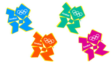
Well, I do know what it is – but what the hell is does it mean? The new London 2012 Olympic logo:

It looks like nothing so much as a mutilated jigsaw, and I fail to see the symbolism in any part of it. Nothing about it says London, or Britain. or sport for that matter. If this is an indication of how the whole sporting enterprise (and the emphasis is on the enterprise, rather than the sport) is going to be run, we’re in for a disaster of epic proportions.
UPDATE: Someone who shall remain nameless to protect the guilty said earlier that it looks like Lisa Simpson giving a blowjob. Well, now you mention it…
UPDATE II: Looks like a groundswell is building already to junk the logo. Add your name to the ‘logo must go’ petition here.
[Query to afpers – is that the Jonathan Ellis sponsoring that petition? If so, for once we are in political harmony.]
UPDATE III: Oh dear. It didn’t take long for the ‘leet ‘shoppers to start having a go. From b3ta:

This is going to run and run, if you’ll excuse the pun…
UPDATE IV
And indeed it is running and running. The latest is that the animated logo ad causes epileptic seizures. Oh dear….