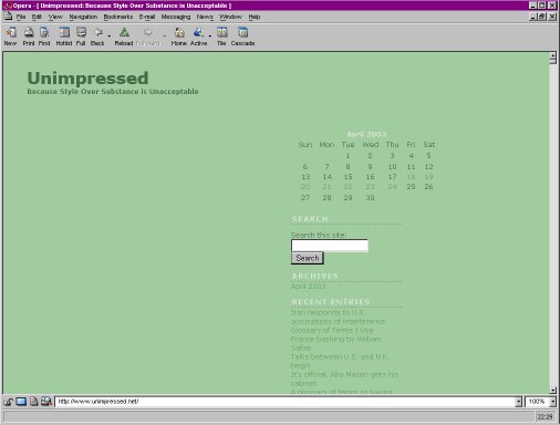
Right now, for instance. Barry links to a newish blog called Unimpressed, which is subtitled Because Style Over Substance is Unacceptable. A pity then that the blog’s design is somewhat of a triumph of style over substance:
- The layout is fairly standard, with the page divided into three columns, but the lefthand column is unused.
- The middle column, which contain the posts is far too narrow and doesn’t read comfortably. Worse, it has a fixed, unadjustable width.
- But the worst thing is, there’s a huge amount of space wasted in the header of the page, with the posts only starting “below the fold” of the webpage. That is, you actually have to scroll down to read the first post; when you first see the page all you see is the header! The comments popup has the same problem, btw.
These problems are easily fixed of course and I hope they will be, as it’s a shame to let style ruin a blog whose substance doesn’t deserve that.
UPDATE: I’ve put up a screenshot of the blog below to make clear what I mean.

UPDATE the second: The blog looks normal now. Excellent.