I don’t quite know why I found this review of The Brave and the Bold #33 so annoying, as I neither read the series nor particularly like the creators (J. Michael Straczynski & Cliff Chang) involved. But it might have something to do with this:
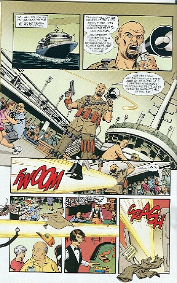
Well, to start off with, Wonder Woman makes yellow light explode out a man’s pants, and not in a good way.
First, I couldn’t tell which direction the yellow stream is even supposed to be going. And what’s with the old duffer’s flying trucker cap? Isn’t it enough to be disrobing one person per panel with unfortunately pee-yellow light explosions?
Grand Ballroom, this way to the yellow pants! It’s like a Dr Suess, except not funny.
Below is the page being mocked. Now, apart from the hilarious joke actually not being all that funny, what is annoying about this “criticism” is that this page surely isn’t that difficult to understand? Two establishing shots with some cruise ship, some terrorist leader yakking away on his megaphone, a superhero flying towards him in a streak of yellow light (“Like pee hur hur hur”), slams into him from behind in the next shot, with the bottom three panels showing the bad guy being pushed at speed over the boat, losing his clothing in the process. The action flows from top to bottom, left to right, with the only tricky bit being the transition between panel three and four, when the camera moves from in front of the bad guy to his back. The art is a bit too static for my liking and a more “blurred” effect on the speed lines would’ve been more clear, but is this really such a bad sequence that pee jokes are the best you can say about it? Really?
Luckily the post moves on from pee jokes when describing the next problem page which, to be honest, could be a lot better:
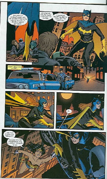
I stared at this page and tried to figure out what the heck is happening. Finally, I decided that her bike flies between panel 4 and 5, although I don’t know why. Apparently so we can see Wonder Woman hanging onto the middle of the bike? I don’t even know.
The sequence in question, at the bottom of the page, is one that’s been used in hundreds of comics in one form or another: guy drives along, suddenly is driving in the air, looks down and sees Superman e.g. holding up his car. It’s done badly here, both because the background in the first two panels of the sequence is not very clear and because the panels themselves are too small, squashed between the payoff panel at the end and the big panels at the top of the page. Even so, how long does it take you to work out what’s happening, even if you’re not so familiar with (superhero) comics?
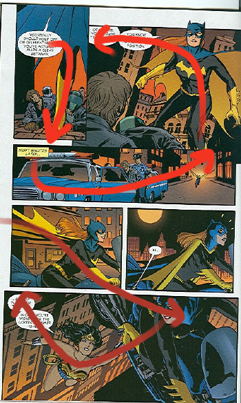
Rather than asking what’s happening here when, though confusing, it is relatively easy to work it out, it’s much more interesting to show why this page can be confusing to new readers or manga readers, as is done in a later post. This is where the final page shown here comes from, on which commenter Telophase has marked up the flow in which a typical manga reader would read the page. According to them, a manga reader would figure out the visual flow from the artwork, rather than from the panel layout — looked at the page this way, it is confusing. Now that’s a good piece of criticism.
I’m not defending this comic; since I haven’t read it I can’t. Nor do I mind people making fun of a comic. What I object to are unfunny, lazy jokes done on material that doesn’t deserve them and the defensive attitude in the comments when a few people voiced their objections. But perhaps it’s a bit much to expect indepth analysis of such a piece of epheremal storytelling when pee jokes are so much easier…