Spark Publications was a very short lived comics publisher, lasting from December 1944 to June 1946 and only managing to put out fifteen issues of three titles in that period: two issues of Atoman, eight of The Green Lama and five of Golden Lad. As the names indicate, all three were superhero titles just as the market for them was crashing as comics readers moved on to other genres like true crime and romance. They never had a chance in the cutthroat competition of what we now call the Golden Age of American comics. Spark in other words was just a footnote in American comics history, barely remembered and rarely mentioned even in fan histories.
So why do I bother with them now? Because thanks to the internet and especially the crazy obsessed comics fans over at the Digital Comic Museum even such minor footnotes to the Golden Age are now archived and preserved and sometimes you find real gems in them. In Spark’s case, they turned out to employ three of the very best Golden Age artists: Mac Raboy on Green Lama, Jerry Robinson on Atoman and Mort Meskin on Golden Lad. What’s more, these are artists with a similar style and they give Spark Publications a much more unified look than most publishers had in the Golden Age, a sort of unconscious housestyle.

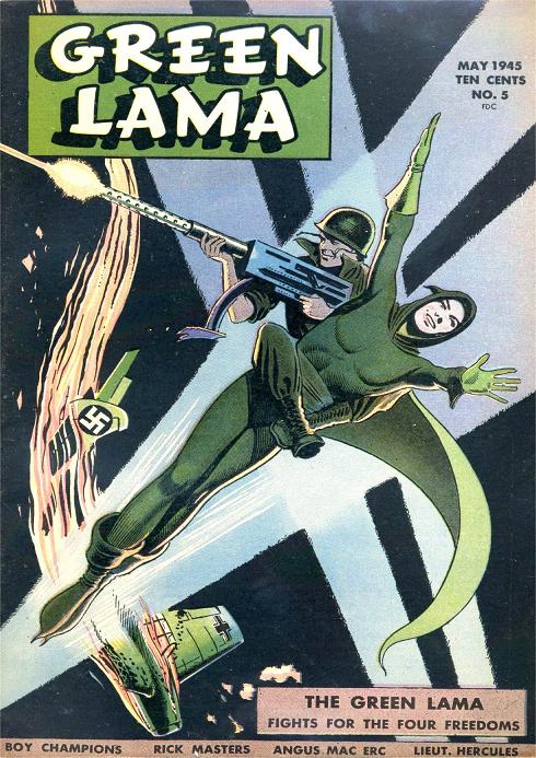
Mac Raboy is best know for his work on Captain Marvel Jr. for Fawcett. His linework and composition was always elegant, even fey, which works well on the Green Lama, certainly not your typical musclebound hero. Especially his covers, like the one above or this one for issue four are masterpieces of style and elegance. His interior work is weaker, not as good as that of Robinson or Meskin, but still head and shoulders above your average Golden Age artist.

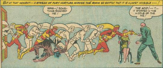
Jerry Robinson is the man who invented the Joker, even if Bob Kane took all the credit for it. Robinson had a long career at DC, but during the Golden Age also worked for other publishers, like Nedor/Standard/Best, often together with Mort Meskin. His work for Spark came after five-six years spent honing his craft and it’s noticable in everything. His art, as in the panel above just oozes confidence. That superimposing of images to show speed here is a bit of sophistication you don’t see often in Golden Age comics, not even by acknowledged masters. And it’s done in an interior panel to serve the story, rather than in a splash page or cover.

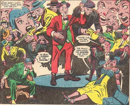
Mort Meskin is probably the best of these three artists, criminally underrated and who never quite got the recognition he deserved. No wonder he fled into advertising later in life. Everything I’ve ever seen of him I’ve loved; I’ve never seen him draw a bad comic. What struck me here is how Ditkoesque this looks, with the floating outraged faces and the slightly rubbery anatomy of the central figures.
Coincidence or not, these three artists all have a similar style, one that stresses elegance and clarity of line above raw expression and it makes their heroes look like they belong in the same universe, an early example of what Marvel would later consciously do with their house style. Spark Publications never amounted to much, but the fifteen comics they put out are well worth a look — and thanks to the Digital Comic Museum you can.