I feel the need to who-viate


Of course Doctor Who is no more than it wants to be, light Saturday evening sci-fi entertainment for the whole family, glitzy and fun, good enough for the hour it takes to watch it. Worrying about whether it should be anything more than this, at this point in time, is useless; it’s pretty clear its creative staff isn’t really interested. Therefore this post is really only for my own amusement, a short examination of what’s wrong with New Who without any expectation that it will ever change.

Last night’s episode was emblematic of New Who’s failings. It had an intriguing premise (little black cubes show up in their billions all over the world simultaneously, then do nothing. The doctor is intrigued, then bored, buggers off to go gallivanting across the universe, leaving the Ponds to deal with Real Life as opposed to Doctor Life, then almost a year later Things Start to Happen and the alien invasion really starts, only it turns out to be more of a weeding than an invasion, with some new alien baddy wanting to get rid of the human plague. In other words, starts off interesting, ends up being yet another overtly complicated alien plan easily spoiled by the doctor waving his sonic screwdriver around for a few seconds.

It’s also fairly incoherent, as the promise made in the trailer above, of the doctor coming to stay for a year just isn’t true, while the plot depends on some fairly big coincidence (the human transmitter needed to boast the signal from the alien ship to the cubes just happens to hang around the very same hospital as Rory works) to resolve itself and some of the bad guys’ actions (kidnapping people into their ship) just don’t make sense if their aim was extermination in the first place. All the fx, banter, witty asides and clever touches do only so much to cover this up even when watching.

In that regard it’s almost the opposite of the old Who, which for the most part was stodgy rather than glitzy, with low budget wobbly sets and cardboard monsters being made up for by good writing and acting, as well as more room to tell a story, not having to depend on just a one hour show to tell it, but being able to take four to six half hour episodes instead. that way the suspense of the little black boxes could’ve been build up and resolved more gradually, more in the background while the doctor went on other adventures, dealing with life on Earth while waiting for them to do their stuff…
The perfect place to start Cerebus

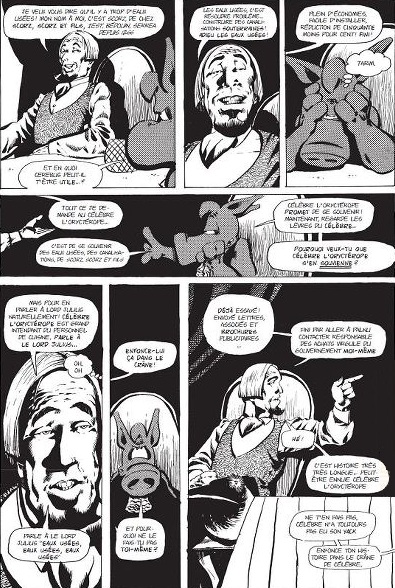
a page from High Society

It’s a strange situation. First you had Dave Sim running a very successful Kickstarter campaign to republish the entire Cerebus series as high quality digital comics, including all the ephemeral content left out of earlier reprints. Then a fire destroyed many of the Cerebus negatives, which, combined with the end through low sales of his Glamourpuss project left Dave Sim pondering the end of his career as a cartoonist. Finally, this triggered a response from Fantagraphics, with head honcho Kim Thompson offering to reprint Cerebus in a more market friendly format:

I’d be perfectly happy to repackage the CEREBUS material in a more bookstore-friendly format than those fucking phone books and give the material the new lease on life it (or at least the first two thirds of it) so richly deserves.

Dave Sim responded and now you have what’s basically a contract negotiation happening in public, which Tom Spurgeon is right to think is absurd. Great fun though and it inevitably leads to thinking about how to start the series. As Kim Thompson put it:

Actually, I feel it absolutely must start at the beginning. CEREBUS is a very complex story and everything builds on what’s come before. The liability is of course that the first several issues are crude and jokey, so you’re not leading with the best work, but if you don’t make these available the stuff that follows is a lot harder to make sense of. That’s a curse of serial comics created by a developing cartoonist.

but there’s a solution to this dillemma and it’s not a difficult one: start with High Society. As Kim Thompson says, the problem with starting reprinting Cerebus from the beginning is that it started out int he late seventies as not that good a parody of Conan the Barbarian as well as other contemporary comics, one of the first wave of creator owned alternative comics, together with series like the Pinis’ Elfquest and Jack Katz The First Kingdom. These first few issues just aren’t that interesting, though Sim develops fast and gets more and more ambitious over time, but they are of a particular time and place and perhaps less interesting if you’re not a hardcore comics fan.

High Society is different. It’s one single story, originally told over twentyfive issues, which if I’m not mistaken was even the longest story told in American comics up to that time. It’s also the story in which Dave Sim came into his potential, complex, cynical, incredibly funny. Best of all, it’s also a story that really needs little to no introduction, no knowledge of what had gone before. All you need is half a page introducing Cerebus, then the story can start with him coing into Iest looking for a room to sleep and expecting to be thrown out of the city, only for everybody treating him with respect and fear and eager to make him happy, which drives him up the wall until he sees a way to profit from it. You don’t really need to know that Dirty Fleagle McGrew and his baby brother Dirty Drew were modelled after Canadian cartoonists Gene and Dan Day to enjoy the story. All you need to know is that it starts off a little bit like Nikolai Gogol’s The Government Inspector and take it from there.

Afraid of heights?


Don’t be; it’s the fall that kills you, but also don’t watch this video, of climbing to work on a 1700 feet height antenna tower. Everytime you think, this is not so bad, the horror gets kicked off a notch. An elevator ride 1600 fee tup? Not so bad. Climbing a ladder up from there safely inside the tower? A bit worse. Freeclimbing on the outside of the tower on a small ladder? Getting scary. Ladder stops and you have to climb the actual frame. Okay, I’m out. Whoops, you now have to climb the antenna itself, using an even flimsier ladder, the hoist yourself over the top and stand over 1700 feet high while trying to do your job? Whoa.

Manara again

J. Caleb Mozzocco, off off Every Day Is Like Wednesday, muses on my own dismissal of Manara’s version of the Scarlet Witch:

Wisse is right, of course, but then, do any characters look like themselves anymore? Close your eyes and imagine just about any superhero character, the Scarlet Witch is a fine example to do with.

[…]

Hell, if Batman and Spider-Man, whose costumes cover somewhere between 90% and 100% of their bodies, look completely different depending on which artist is drawing them. Neither DC nor Marvel use style guides or character bibles or character designs of any kind to dictate how characters look anymore. The Hulk can be anywhere from six feet tall to 20 feet tall, a foot across or eight feet across. Sometimes Spidey’s built like a praying mantis, sometimes like a runner, sometimes a swimmer, sometimes like a competitive body builder.

It doesn’t need to be this way. If you google for images of classic Belgian comics character Spirou, the images you get, whether by Franquin, Fournier or Janry, are recognisably of the same character, even if you omit the bell hop uniform he insists on wearing. (This is also a great example of how “simple” you can make a character design and still make it distinctive). Granted, European comics have always been more stringent in setting guidelines for what their characters look like than American comics have been doing for decades, but even in American comics it’s possible to have widely divergent art styles and still show the same recognisable character.

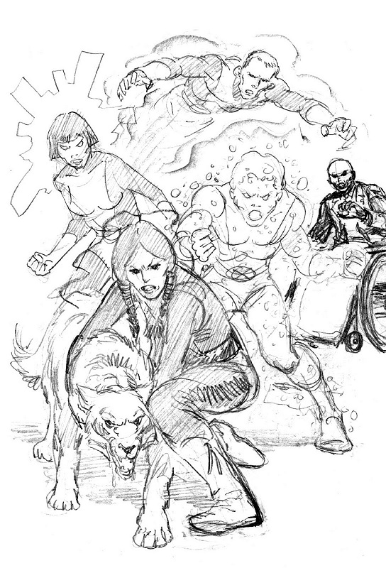
New Mutants by Bob McLeod

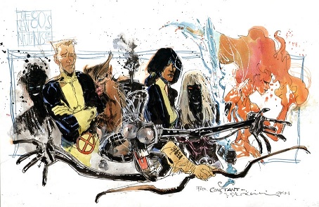
Remember the New Mutants? First ongoing X-Men spinoff series, back at a time when that was still unusual, it debuted with a graphic novel (also unusual) written by Chris Claremont (who else) with art by Bob McLeod, who also was the first artist on the series. McLeod was, how shall we say, competent but a bit dull, a bit worthy, a decent realistic draughtsman in the Adams/Byrne tradition. Then, with issue 18, a new artist took the reigns: Bill Sienkiewicz, whose style was quite different. Yet if you look at the McLeod version of the New Mutants and Sienkiewicz’s version below, you can still recognise who’s who.

New Mutants by Bill Sienkiewicz

Art style, interpretation, house style, even the technical competence of an artist can make a hell of a difference in what any given character looks like from issue to issue, but they can still be recognisable as that character even out of uniform (or even nude, as iirc Byrne once said). With Manara’s Scarlet Witch this just isn’t the case: strip her uniform away and she’s just another Manara woman.