“Omaha” the Cat Dancer 07 — #aComicaDay (12)

It’s always hilarious when funny animal characters own pets.
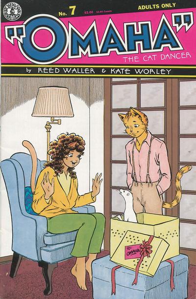
An anthropomorphic cat girl is seated opening a present, while her cat boyfriend stands next to it looking on. The present is a ferret.

One of those series I only got through buying back issues when I came across them, which is why issue 7 is the earliest one I have. “Omaha” the Cat Dancer was a long running funny animal, or rather, furry comic that got its start in various underground anthologies zines in the late seventies and then its own series from Kitchen Sink in 1984. Why there were quotation marks around Omaha in the title I still don’t know. Created by Reed Waller, with art and later also writing by Kate Worley it lasted some twenty issues there, plus a few more at Fantagraphics. By 1995, after Worley had been in a car accident and Waller had gotten bowel cancer, they split acrimoniously and the story would not be completed until 2006, at which time Worley had sadly passed away from cancer.

A rather unhappy history, which may explain why this series is now relatively obscure when it was critically well received at the time. It may seem a bit strange now, but furry comics were actually a not inconsiderable part of the direct market back in the eighties, featuring some of the most interesting work done — even Fantagraphics had Dalgoda and Usagi Yojimbo after all. And while the cover here is cute, Omaha was far from a kid friendly funny animals series, but one in which sexuality and queerness were an integral part of the story. These animals fucked and fucked uncensored.

Which, in the rather puritan America of the Reagan and Bush years put it right in the firing line at a time when comics had once again come under scrutiny from the usual crusaders for decency and cleanliness. In 1986 the manager of the Friendly Frank’s comics store was arrested and prosecuted for distributing obscene material, which included Omaha. This, as it did in the 1950s put the fear of god into the comics industry and led to a lot of self censhorship and refusal to carry certain titles by distributors and shops, something Omaha also suffered from.

No wonder then that one of the ongoing subplots in the series was about similar attempts to regulate strip clubs in Mipple City, the fictional not in anyway based on Minneapolis twon in which the series is. Omaha, the “Cat Dancer” is herself an erotic dancer; her boyfriend Chuck is heair to a wealthy business tycoon. While the series started mostly focused on the political and the theme of censorship, it quickly became much more interested in the relationships between its characters. Kate Worley called it an “adult funny-animal soap opera” in an interview in Comics Scene 17 which covers it well. It’s not just Omaha and Chuck, but there’s also their gay friend Rob who gets to be sexually active in its pages as well as Omaha’s best friend Shelley, who ended up in a wheelchair after an accident. The topic of her sex life and whether that’s even possible comes up in this very issue.

Having only a few issues of this series, it’s a pity the collected editions seem to be out of print.
The Losers Special — #aComicaDay (11)

“Losers Die Twice” — because the first time was in Crisis on Infinite Earths #03 and done in one panel and Robert Kanigher probably objected.

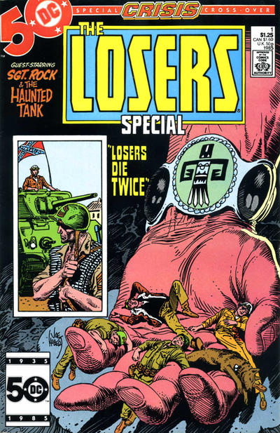
A giant hand holding the dead Losers

DC’s war comics, by 1985 reduced to just SGt. Rock and G. I. Combat, had always been kept separate from their superhero titles. While a Sgt. Rock or the Haunted Tank might pop up in a Brave and the Bold issue, you wouldn’t see Batman in Weird War Tales (despite the Creature Commandos being superheroes but in name). Therefore when in the third issue of Crisis the story moved to July 1944 in Markovia (fictional homeland of Geoforce) and various of DC’s war heroes did get drafted in, leading to the death of the Losers, DC decided to also send them off in their own special. Where they died again, but during a proper war story with no superheroes.

The Losers were a Robert Kanigher creation. Kanigher was a writer who had been working for DC Comics since the Golden Age and in the fifties became the main editor and writer for their war titles, something he would keep up until DC cancelled them all in the mid-eighties. The Losers were created in 1969-1970 from characters that had had their own series in the sixties. There was Johnny Cloud, the Navajo pilot, Captain Storm, the PT Boat commander and Gunner and Sarge, Marines (with Pouch their dog). Each of them had been the last survivor of their respective units hence their team name. their series ran in Our Fighting Forces from 1970, from issue 123 to 181, ending in 1978. Bar a few guest appearances in other war comics they hadn’t been seen since.

The special therefore retells each member’s origin stories in flashbacks while they join Sgt. Rock and the Haunted Tank on a mission to destroy a Nazi missile battery in the closing days of the war in Europe. As each origin is told, they die in order but in the end are taken away by Johnny Cloud’s Great Spirit, as depicted on the cover, to presumably some sort of Navajo version of Walhalla. The interior art is by Sam Glanzman, himself a WWII veteran and Judith Hunt, best known as the creator of Evangeline, with writing of course by Kanigher and the cover by Joe Kubert, in case you couldn’t tell. As a story is a typical gloomy Kanigher tale, a way to provide a dignified end to characters out of place in the “All-New DC”.

Nostalgia Comics 01 — #aComicaDay (10)

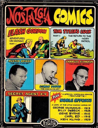
All your favourite newspaper adventure comics — but not necessarily with the creators that made them your favourites.

Panels from Flash Gordon, Tim Tyler and Secret Agent X-9 interspersed with three profile shots of Austin Briggs, Lyman Young and Charles Flanders

By the seventies there was a growing appreciation and interest in the history and artistic merit of comics and especially newspaper strips, which led to various reprint projects, most notable being the The Smithsonian Collection of Newspaper Comics (1977). Another such project was Nostalgia Comics, which started in 1970 with big ambitions to “the finest adventure strips and the most warmly-remembered (and occassionally forgotten) humor features that have a[[eared since Richard Outcault drew the first Yellow Kid back in 1895″. If this first issue is any indication however, the people behind this project had an interesting definition of what that entailed.

Because while the strips featured — Flash Gordon, Secret Agent X-9 and Tim Tyler’s Luck — were indeed fondly remembered and critically acclaimed features, the first two are not represented by the artists that made them great. In the case of Flash Gordon, what is reprinted is the start of the daily newspaper strip, rather than the Alex Raymond drawn Sunday pages. Drawn by Austin Briggs, a longtime assistant to Raymond on the Sundays, the dailies with their much more limited space are nowhere near as lush or interesting as the original feature could be and at this time Briggs is clearly still figuring out these limitations.

Similarly, while Secret Agent X-9 was a daily feature from the start, Charles Flanders was not its originator; he had taken it over from Dashiell Hammett and Alex Raymond who had left when it wasn’t quite as successfull as they had hoped for. But they had established the style of the strip, which meant Flanders was more or less stuck with it.

Tim Tyler’s Luck, created by Lyman Young meanwhile was always somewhat of a second banana, which also had some trouble finding its voice. It started out as an aviator strip, but only found its feet when Tym Tyler and his pal Spud got lost in “Darkest Africa” and joined the Ivory Patrol combatting various miscreants in some undefined region of the continent. Not really a strip I’d seen before, but it still ran from 1928 to 1996. Which is longer than Secret Agent X-9 (1934 to 1996) and Flash Gordon (1940-1944, 1951-1992 with a reboot only last year) both so somebody must’ve liked it.

Each of these strips and their creators is introduced by none other than Maurice Horn, one of the pioneering comics historians, who provides a quick overview of each feature’s history and artist’s background. Rounding off the issue are a collection of early strips by people who’d become famous for other ones late, by George McManus, Billy DeBeck, Gene Byrne, Carl Ed and Ken Kling. Slightly oversized and on nice white paper with cardboard covers as a book this looks great even if the strips themselves might be of slightly less interest.

Mister X 01 — #aComicaDay (9)

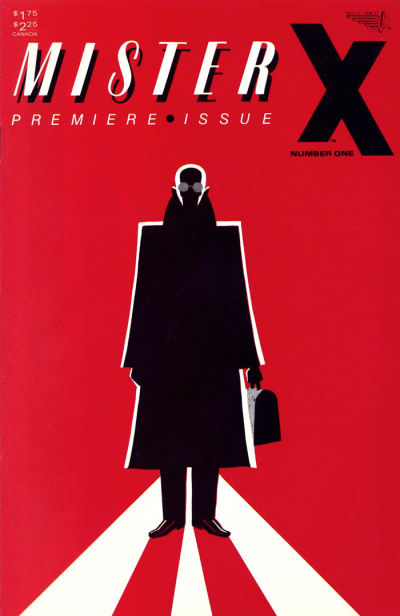
Mister X: style over substance but what a style. Because this is a superhero comic done by Jaime, Gilbert and Mario Hernandez.

A silhouette of a man in a suit, bald, with round glasses, holding a small case in his hand, against a red background.

It all started as a project by Dean Motter, who was mostly working as an album cover designer at the time but also worked in comics, e.g. on The Sacred and the Profane with Ken Steacy on art. He envisaged Mister X as a ‘sleepless detective’ operating in an art deco superscience city called Radiant City. But he couldn’t do it alone so brought in Paul Rivoch, another illustrator, who helped shape the city and created a series of ads for the upcoming comic, which was to be published by Vortex (who would later publish Chester Brown’s Yummy Fur. But he and Motter had different opinions on what the series should be and he was no longer interested. So editor Ken Steacy, Motter’s old friend, had a brainwave and asked the Los Bros Hernandez if they were interested…

They would last only four issues. A small matter of Vortex not quite paying them as agreed. Nevertheless Mister X continued with another alternative comix future star on art duty: Seth! In all there would be fourteen issues, followed by a second series with an entirely new creative team from Vortex. After Vortex itself closed, there would be reboots, collections and sequel series over the decades, mostly through Dark Horse. It’s all a bit confusing and there doesn’t seem to be a proper collection of all its various incarnations yet. Frustratingly, I have the first three issues but not the fourth it looks like.

If you can find any of those first four issues they are worth seeking out, with a young Jaime Hernandez doing the artwork, as well as backup stories with art by Gilbert. Both of which look as good as they do in Love and Rockets. The remainder of the first series and second Vortex series may be interesting as well, if you’re on the lookout for early work of people who would became known for much different projects much later. One of those ambitious eighties projects that sadly stranded in the mundane problems of getting it published and especially published on time….

Blue Bulleteer — #aComicaDay (8)

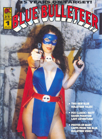
Proof positive that superhero costumes don’t actually work on real people.

Mary Capps modeling the Blue Bulleteer costume in a photo by Bill Black. She's wearing a blue plkastic mask covering her eyes, has two guns, one aimed at the reader. Her blue skirt has a lot of cleavage and leaves her thighs bare as well. Her cape is red and a skull badge is holding it closed as another skull badge holds her red belt in place

At least not with some serious alterations. What looks stylish in the comic just looks cheap and tacky on a real person and I can’t imagine how it would look in action in the video Bill Black announces in his editorial.

The Blue Bulleteer is AC Comics’ trademark friendly version of Golden Age superhero Phantom Lady, who was first published by Quality Comics in the forties. When they went out of business in 1956 DC Comics bought their assets including the rights to Phantom Lady and would eventually reintroduce her with a host of other Quality heroes in the 1970s Freedom Fighters series. However in the meantime another publisher, Fox Features had created its own version, having gotten the rights from Iger Studios who had created the Quality Comics version in the first place. It’s the Fox version that would became notorious, as one of the covers was used as an example of how perverted and deranged comics were in Wertham Seduction fo the Innocent… Blame the artist, Matt Baker, for being so good at drawing beautiful women as one of the best of the socalled good girl artists.

AC Comics had started off as Paragon Publications back in 1969 and still exists today. Its formula has remained unchanged over the decades, providing a mixture of reprints of public domain Golden Age series (and ciontinuations of same) with original superhero and other series focusing on “Good Girl Art”. Niche, but it works: their flagship title, Femforce has been in publication since 1985. Not even very many Big Two series can claim the same. Blue Bulleteer is also part of Femforce in her modern guise of Nightveil, relying om magic rather than guns. As the Blue Bulleteer she was active in the forties.

This special celebrates 25 years of her as a character and reprints various Bill Black stories about her. The highlight though is a reprint of one of the Matt Baker’s Phantom Lady stories. There’s also a John Beatty cameo in the Blue Bulleteer photo section at the end of the issue.