Protectors 05 — #aComicaDay (64)

This book has a hole in it I-it’s not mint! Dear god in heaven it’s not mint! People, I give you the dumbest ever cover gimmick, courtesy of the good folk at Malibu.

A bloody bare chest takes up most of the cover, with two bloody hands held in front of it and the character's mouth wide open, only his bottom teeth visible. Int he center of the cover is a literal round hole

This stupid stunt only makes sense in the context of when it came out. By the early nineties, comics had been overrun by speculators, idiots who bought them as investments. These had already crashed the market once before in the 1987 black and white bust, when everybody looking to be the next Teenage Mutant Ninja Turtle launched their own much crappier version, speculators bought them until even they realised they were worthless and dozens of comic shops went bankrupt, left with thousands of unsellable comics. By 1992 though this was long forgotten as more and more people started treating comics this way, thanks in no small part to price guide magazines like Wizard judging comics only by how ‘hot’ they were.

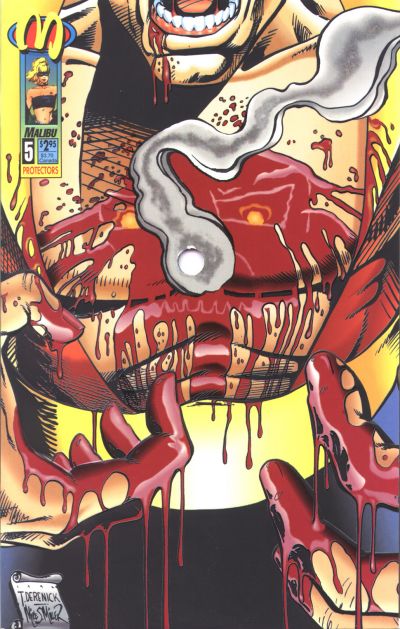
And what makes a comic hot? Not so much a good story or great artwork, but whether it had the flavour of the month artist on it, or guest starred a particular character, or was important in some way other than in being an enjoyable read. Books like the Turtles had become hot through years of hard slog and word of mouth sales, but that’s difficult. Far easier to just slap a gimmicky cover on your comic instead. People loved that shit in the nineties. Gatefold covers, chromium covers, gold or silver foil covers, covers you can rub the blood on, anything that made a cover special in any way was like catnip to collectors. Most of those were harmless fun, but one or two, like DC’s Eclipso: the Darkness Within #01 had gimmicks that could do actual damage; in this particular case because it had a fake plastic gem glued to the cover which is not good for whichever comic is put in front of it. Protectors #05 went a step further: it actually damaged the book it was covering. The hole after all went through the entire issue.

If this sounds like a parody of what somebody wanting to spoof the special cover craze, that’s because it is. Malibu stole the gimmick from a small press title, Jab, whose third issue had its entire run shot through with various calibres of guns, to create several variant covers! That comic had been actually designed for it, but here Malibu had just punched a hole without any thought on how to incorporate it in the actual story and page composition. It’s very clearly something that was done afterwards, inspired by or stolen from that Jab issue.

I remember seeing the ad for the original Jab issue in Advance Comics, a few months before Protectors 05 came out. Even in there it was very much presented as a joke, so I was flabbergasted when Malibu did it for real. Just unbelievably crass and stupid all round.

The actual comic? Ehhhh. Protectors was a superhero series created out of old Golden Age characters from the long defunct Centaur Comics, written and created by R. A. Jones, with Thomas Derenick, who also did the cover as inked by Mike S. Miller. This issue featured the death of Nightmask, whose chest the hole was punched through on the cover. On the whole, one of those series that looked better in the Comics Scene interview I read about it then in the actual series. Even so, it really didn’t deserve this cover.

Wat Vooraf Ging — #aComicaDay (63)

Dutch cartoonist Hanco Kolk goes into What Came Before the creation of various famous characters, from Romeo & Juliet to Batman, Mickey Mouse to Cinderella.

A red cover with the title and author on the left and stylised portraits of various famous characters on the right including Batman and Cinderella

Hanco Kolk got his first comic published in the same year I was born, 1974, in legendary underground zine Tante Leny Presenteert, when he was 17. Cutting his teeth on underground and amateur zines in the seventies, also founding his own, he moved into more commercial comics work in the 1980s, his most famous creation being Gilles de Geus, “the Dutch Asterix”, on which he worked together with Peter de Wit as scenarist. These two worked together a lot, including on an actual television course on how to become a cartoonist, as well as the still running Singles newspaper comic strip. On his own, his Meccano series of graphic novels has been critically acclaimed both in the Netherlands and France.

Wat Vooraf Ging (What Came Before) is drawn in Kolk’s usual Clear Line style and starts with Romeo and Juliet, each story linking to the next on its last page. In order, these go from Romeo and Juliet to Batman, Cinderella, Mickey Mouse, Frankenstein, Dracula and finally Sherlock Holmes. In each case a lot of other characters and stories are also talked about, showing how they influence the feature creation or were in turn inspired by them.

For the most part this is going over well known territory if you know these characters, but for me at least there were still surprises here and there. Not in the least the fact that Cinderella is a story so old it has been around in one form or another since literally the Stone Age!

Whether or not these precursors were actual influences is not always knowable of course. For example, Kolk starts his examination of Batman’s origins with Pierre Picaud, a 19th century shoemaker rather than much more obvious and later influences like Zorro. And the reason he does so was because Picaud was the real life inspiration for The Count of Monte Cristo. Picaud was betrayed by his friends, accused of being an English spy for which he was imprisoned, after which his friends took his fiancee and fortune for themselves. Once he got out of jail he took revenge and murdered them, for which he got the death penalty. From there Kolk shows the evolution of the masked avenger step by step, from the Scarlet Pimpernel all the way to Batman.

This was the last comic I bought in 2024 and the first I read this year, therefore a good one to re-open this series with.

Animal Man 09 (Spanish) — #aComicaDay (62)

It was reading this comic while walking along the sidewalk that made me walk into a lamp post face first, on a school trip to Barcelona, to the amusement of my class mates.

Animal Man is on the right having opened the door for the Martian Manhunter who stands in door opening. In front of him are two not too bright looking technicans holding pieces of high tech security kit

Yes, I was the kind of teenager that would buy a superhero comic in a language he doesn’t speak as a souvenir rather than something more appropriate. I didn’t even have the decency to buy an actual Spanish comic! That was the kind of nerd I was unfortunately. The rest of school trip was eventful. We saw the usual things you see in Barcelona: Sagrada Familia, the parks, some musea I don’t remember. Got food poisoning with half the class from the dodgy paella served on the first night in the bording house we stayed at, drank sangria with a couple of class mates in a McDonalds, nothing as interesting honestly as that issue of Animal Man was.

That was in 1990 and the first issue of Animal Man I ever “read”. I knew about the series already, from an interview Grant Morrison did with comics Scene, but my local comic shop didn’t carry it. Which meant the moment I saw that Brian Bolland cover on some newsstand I had to buy it (together with a copy of Invasion 3).

Fortunately, this is not one of the more complex issues Morrison ever wrote. It’s just the Martian Manhunter visiting Buddy Baker’s family home to install a new security system and teleport system now that Animal Man is a member of Justice League Europe, following on from the Invasion crossover series. As his son is being bullied and has his bike stolen, Buddy himself is struggling with his powers, which have been affected by what happened during Invasion, consluting with the Martian Manhunter about it. The Manhunter also helps his son get even with the bullies.

There are several subplots going on in the background that will tie in with the series overall story, but on the whole this is a very normal sort of superhero story, one that could’ve been published in any other superhero series. A typical sort of breather issue, where we look into the hero’s personal circumstances while they rest between adventures and the stage is set for the next big event.

The reason I was reminded of this comic was because I’ve spent today reading the Animal Man Omnibus, which collects Grant Morrison entire run on Animal Man. Because it was one of the founding series of the Vertigo imprint a few years later, I always tend to think of Animal Man as being much weirder and isolated from the bigger DC Universe than it ever actually was under Morrison. This issue is a good example of how it was still a part of that wider, much more traditional universe even when Morrison was doing their best to kick the legs from under it later on.

It also shows that Morrison’s Animal Man was never a series that would appeal to a non superhero comics reading audience, like e.g. Sandman was. You can read the series while never having read any other superhero series, but its appeal is still firmly to the sort of nerd who’d actually care for an obscure character like Animal Man in the first place.

My !mpact Comics Wishlist

As I said when talking about The Jaguar 01, DC’s !mpact imprint was the first time I was in on the ground floor of a new superhero universe and therefore it has a special place in my heart. DC’s attempt at using the old Archie/MLJ superheroes to create a new reader friendly superhero imprint, !mpact lasted for little over a year. At the time I bought everything published under it, but there are still some gaps in my collection. This post therefore is a list for me to find when going comics shopping again. In total, !mpact published the following titles:

  • Black Hood, 12 issues, 1 annual: complete
  • The Comet, 18 issues, 1 annual: complete
  • The Crucible, 6 issues: missing #03-#06
  • The Crusaders, 8 issues: missing #08
  • The Fly, 17 issues, 1 annual: missing #17
  • Impact Christmas Special, one issue: complete
  • The Jaguar, 14 issues, 1 annual, complete
  • Legend of the Shield, 16 issues, 1 annual: missing #14, #16
  • The Web, 14 issues, 1 annual: missibg #12
  • Who’s Who in the !mpact! Universe , 3 issues missing #01-#03

Basically then I’m missing 11 issues out of 115. The Who’s Who in the !mpact! Universe will probably be the most annoying to find, as these were ring binder inserts (and I also need the ringband itself).

Grendel: Warchild 01 — #aComicaDay (61)

This is a 1992 science fiction series so the Simon Bisley cover is de rigeur even if the inside art is as different as it gets.

A monstrous Grendel with a hook for a hand with the blood dripping off

The first in a ten issue miniseries and the first ever Grendel story I’ve read. Bisley’s cover is what drew my eye but the interior artwork by Patrick McEown, of which more later, is what got me to buy this series.

The story is simple. We open with a hover motor and sidecar fleeing through the desert. Riding it are a man dressed in black, wearing a black mask with white eyes and a boy in a hoodie. We don’t know who or what they’re fleeing until we go to what looks like a simple chalet but which hides a much larger complex below to see various murdered soldiers and we learn that somebody has kidnapped the heir to the Grendel-Khan. An elite group of soldiers dressed in red body armour is sent off in pursuit on their own hover bikes. They ambush the black clad man and the boy but are killed by him. After they reach Chicago they run into a gang that hates Grendels and think the man is one. He kills them in hand to hand combat and they continue their journey, to New York.

We don’t know why this man has kidnapped the heir or what his goal is or even where they’re going to. Any context we get is from the people responding to the kidnapping, a nameless woman who clearly seems to be some of leader and her assistant Heath. We also meet the woman’s daughter, Crystal, who is kept in the dark as to what happened. But the real context is given in the text box of the front inside cover, that starts with “Chapter 41: Devil in the Desert”, giving us the title of the story and which explains the setting. It’s the 27th century: the late Grendel Khan Orion Assante unified the world. His heir, the boy is Jupiter, who has been cloistered away in that complex we saw, in the Dakota Black Hills, held captive by his stepmother, the reigning regent Laurel Kennedy Assante, the woman trying to get Jupiter back.

But wait a minute. Chapter 41? But isn’t this the first issue of this miniseries?

Well, yes, but this was supposed to come out as the 41st issue of Comico’s Grendel series. Matt Wagner had startedGrendel at Comico as a three issue black and white series: the adventures of gentleman villain Hunter Rose. Wagner reworked this story after the series cancellation in backups to his other big Comico series: Mage but then was done with Grendel, or rather, Hunter Rose’s Grendel. Grendel became a persona that other people could take over and use, or be used by and the second Grendel series explored this, with various new characters picking up the role. Unlike the earlier stories, Wagner would only write, not draw the series, getting new artists for each story arc. By issue forty Grendel has basically taken over the world and Wagner had reached the end of what he wanted to with it. ut then he thought off the story that would become Grendel: Warchild… The idea had been to hand over Grendel entirely to other creators, creating a second series called Grendel Tales, then continue Grendel with issue 41 some months later, but then Comico went bankrupt..

An example of McEown's art

It took two years for everything to clear up and Grendel: Warchild would end up at Dark Horse instead. I’m not sure exactly how much of this issue had been drawn already, but Amazing Heroes Preview Special 11 from Fall 1990 had one McEown page featured in its Batman vs Grendel article. Patrick McEown is an interesting artist. At the time his artwork reminded me of European science fiction artists like Enki Bilal or even Moebius, but now it feels more mangaesque to me? Especially the fight scenes, which are both brutal and funny at times. McEown hasn’t done much else either before or after Grendel: Warchild, having mainly worked on various Aircel series in different roles. A pity, because I like his art.