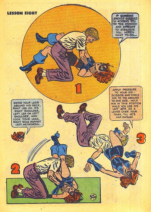
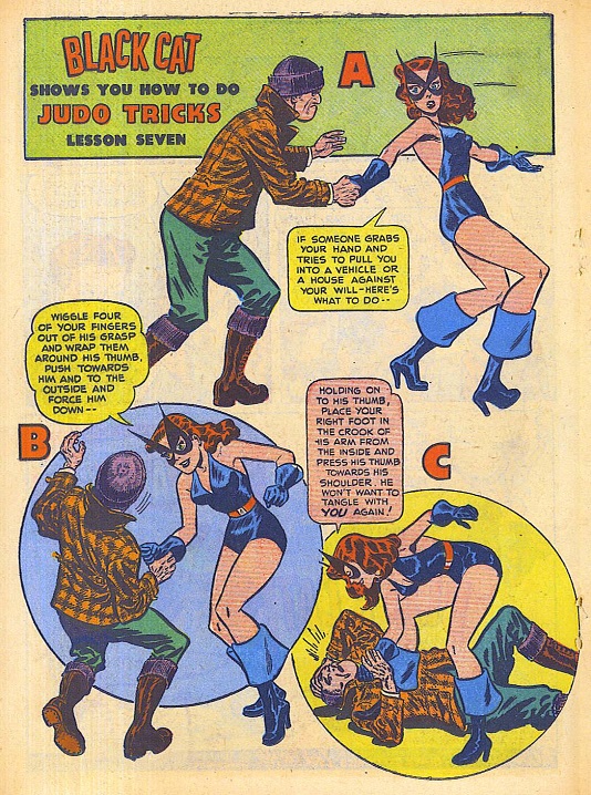
One of the more fanciful scenarios the Black Cat was teaching her readers.
Comix
Marissa Delbressine’s sketch
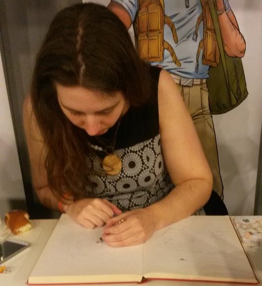
The Dutch Comic Con was partially sponsored by the publishers of Eppo magazine, the bi-weekly comics zine that seems largely aimed at nostalgic forty and thirty something people remembering its original incarnation. As such the audience at the comic con turned out to be slightly too young for them and the artists signing at their stand were not the busiest, shall we say? Where at a normal convention you’d expect long rows of people interested in autographs or sketches, here the artists outnumbered the fans when I came round with my sketch book. Which gave me the opportunity to talk to Marissa Delbressine for somewhat longer than I’d expected, which is always nice.
Marissa Delbressine is the artist on the action adventure comic Ward which has been running in Eppo and so far has been collected in two albums. Written by veteran scenarist Willem Ritsier, it is the sort of uncomplicated adventure comic that could’ve been published three decades ago too. What I like about is that it’s so family orientated: the series may be named after the mysterious loner Ward, but the real protagonists are the Kessel family: Frank, Isa and their two children, Lonneke and Tom. It’s rare to see any sort of happy but realistic family in a comic like this and especially since the two women graduated from their professional hostage status at the end of the first story, each of the characters has come alive.
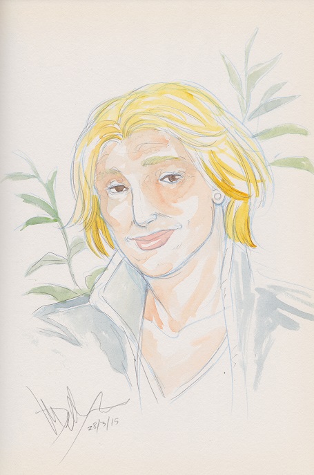
Delbressine’s art is a huge part of the appeal of Ward to me. For the strip she draws in the realistic tradition of e.g. a William Vance, but she isn’t afraid to inject a bit of cartoonish exagerration in her figures, especially the faces. What I especially like is the way her characters are immediately recognisable, none of them quite the archetypical action figure or superheroine. I like the way she shows the difference in ages between e.g. Isa and Lonneke: it’s immediately clear that the one has a couple of decades on the other, without having to fall back on the stereotypical signifiers of age like greying hair or wrinkles. Below is the sketch she did of Isa, coloured in and all. More of her work can be found at her Tumblr art portfolio.
Dutch Comic Con
Coming back from Imagicon last week I was sat with some cosplayers discussing rumours about the Dutch Comic Con, being held this weekend. Apparantly the organiser had run into money troubles, various guests had cancelled or were supposed to threaten to cancel and it was all a shambles. Worrying news, as I’d just bought tickets for it, but on the other hand most of the guests were of little to no interest for me, various actors and such, some coasting on their appearances in a fondly remembered decades old SF classic, some being supporting actors in a current telvision fantasy hit. All great for those who like that sort of thing, but it’s not my fandom. For me therefore I didn’t matter too much as long as the con went ahead: worst case scenario it would just be another comics con, where the main attraction is the opportunity to buy loads of shit at reduced prices. Best case scenario it would be something special, more in line with English or American comic cons.
The end result turned out to be somewhere in the middle. The con seems to have consciously modelled itself on the San Diego Comic Con and similar, with the main attraction being the media stars and the comics reduced to a supporting role. The disadvantage there being that if you’re not quite as interested in that sort of stuff, there was indeed little else to do but walk around and look at the various merchandise and retailing stands. Unlike Imagicon, there was no real programme other than the various Q&A sessions with the guests and the movie programme running in the cinema, no real room to sit down for a while otherwise. After a few hours of this, I really felt it.
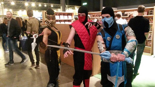
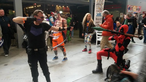
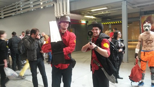
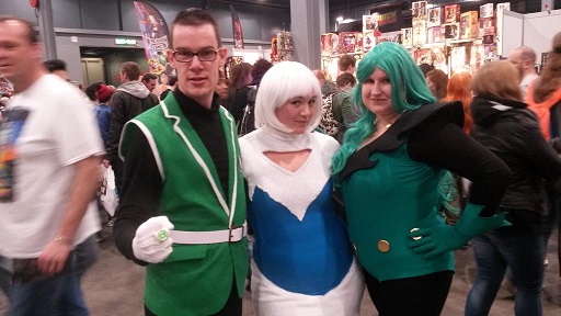
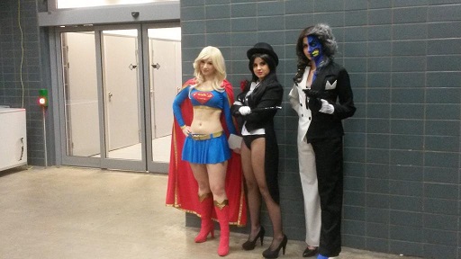
What made this more than just another “stripbeurs” was the audience, which like at Imagicon was young and very much into cosplay, as the pictures here show. 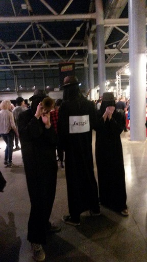 Some indeed, like Hawkeye in the first pic there, were at both cons. What I liked about the cosplayers was their enthusiasm, skill and generousity. People were more than happy to pose and some groups and people were very popular. There was some real creativity there as well: not just your Deadpools, Storm Troopers, Black Widows, Lokis and Thors (this time both in male and female versions), but I also saw a captain Haddock, a trio of Giffen era-JLA cosplayers doing Guy Gardner, Fire & Ice and an absolutely adorable father/baby combination dressed up as Where’s Wally. As always the cosplaying seemed to be roughly equally divided between immediately recognisable movie/tv superheroes, obscure to me but apparantly massively popular figures from anime/manga/videogames and the occassional sui generis character, like the frog man from Fables I saw.
Now I could’ve taken many more pictures of cosplayers, were it not for the pressures of the crowds. I’ve heard reports that at its peak the con had some 16,000 visitors and I can well believe it. At times getting through the crowd was … difficult… 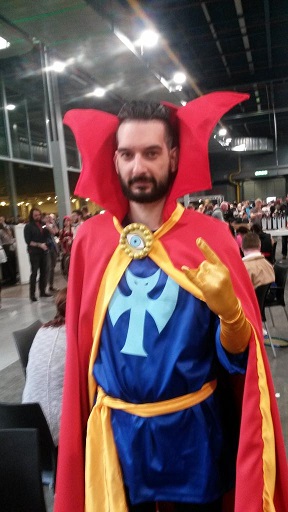 The layout of the con didn’t help. There was a huge, largely empty hall for the Q&A/music sessions, there was the main hall where you came through which was badly lit and confusingly laid out with the main sponsors and retailers, as well as the space for the autograph sessions, which took up a huge chunk on the side of the hall with crowd barriers and such but where you could only see which person was signing once you skipped the barriers and walked to their table. The secondary hall, where all the smaller retailers and standholders were located, also had a lot of wasted space at the edges and at least one lane that was too narrow, leading to huge traffic jams. It didn’t help one of the ways to reach it was through one of the con center’s food outlets. What happened to the artist alley was even worse, a few picnic tables put together in a corner inbetween the main and secondary halls, easily overlooked. Not helping matters was the lack of sign posting everywhere.
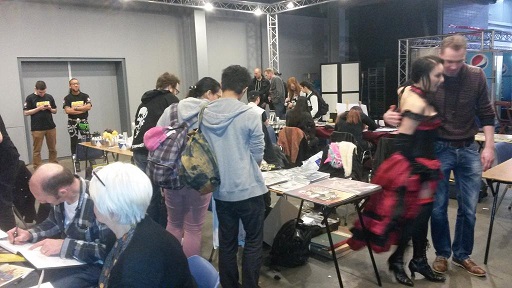
These are all typical first con growning pains and if the con is repeated next year, I hope they’ll go for a different layout. For my part, I had a blast visiting and talking to the people manning some of the smaller stalls, like the people at the new comics artist collective Taus Art, your archetypical indie comics makers. I also spent half an hour talking to Eelco Koper, whose Superhelden magazine is busy addicting a new generation of readers to the best of all ages superhero comics, including Paul Grist’s Mudman and Dave Sim’s Cerebus (!). And because the audience wasn’t quite in the Eppo range, I could also spent some time chatting to Eric Heuvel and Marissa Delbressine while they were sketching, which I’ll scan in and post separately.
Considering it seems the con has been a success and assuming it will be repeated last year, what would I like to see done differently?
- A better layout, with less wasted space, room for people to just sit and hang out that’s not part of a food court, better lighting in places, more room for cosplay and photographing of same outside the main traffic
- Much better signposting as well as more announcements of what’s going on
- A proper artist alley, preferably combined with all the fan organisations and others now lost in the crowds amongst the stand retailing overpriced statues
- Multi track programming with more to do than just listen to Q&A sessions with actors or getting your picture taken with the Batmobile and a larger emphasis on the comics part of the con.
- Less perhaps of the traditional Dutch comics con stuff, more of a focus on US and Japanese comics/fan culture.
That should do it.
The Black Cat Teaches Judo (7)
Friday Funnies: Lighten Up
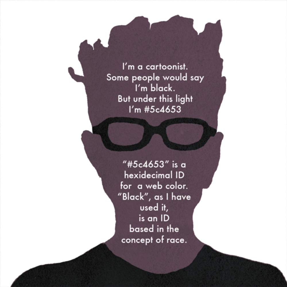
“Lighten Up” is a comic Ronald Wimberly created about his feelings when an editor asked him to lighten the skin tone of a character in a Wolverine comic. As told, it’s one of those incidents you could call micro aggressions, one of those moments where the (unconsciously) racist assumptions underpinning (American) society come to the fore. If you’re not subject to them they can be easily overlooked or dismissed, but as seen here, they do resonate.
What got me thinking is when Wimberly aks whether a black editor would’ve asked him to change that skin colour only to note that he’s never had a black editor in twelve years working in comics. Because Marvel has had black editors in the past; Christopher Priest and Dwayne McDuffie frex. But they’re still rare to non-existent enough at the big comics companies for somebody to be able to work for over a decade without ever encountering one. And that’s a worry, because without people of colour, black people in positions of power within comics, the concerns of their readers and creators of colour will always come second.
Apart from its message, I just like the comic itself. It can be hard not to make a non-fiction comic into a succession of talking heads and static shots with most information carried through the text but Wimberly succeeded admirably. If you just had the text to read you’d miss so much; the continuous juxtaposition with html colour codes frex, or his use of Manet’s Olympia, or that “pin the tail on the racist” panel, a great example of text and drawing contradicting each other.
