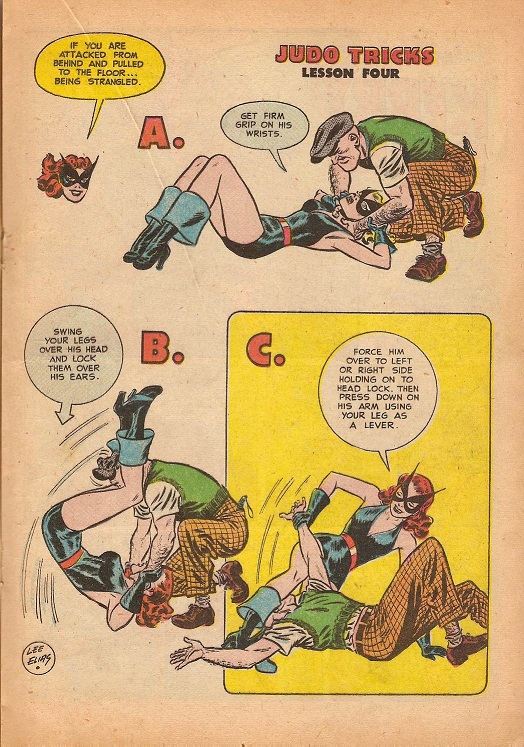
That’s the weirdest, most awkward way to strangle somebody from behind I’ve ever seen. This is a fetish for somebody.
Comix
Brett Ewins
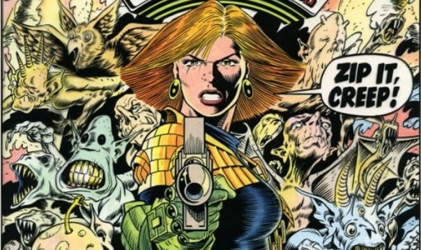
British comics Twitter this afternoon was rocked by the news that legendary 2000AD, Deadline, Johnny Nemo and Skreemer artist Brett Ewins had died. He had been one of those artists that never quite gotten the recognition they deserved but who was quietly influential to whole generations of artists, his influence noticable in people like Jamie Hewlett or Kieron Gillen. He was also one of the people responsible for what you might call the housestyle of 2000AD, a somewhat exagerrated, loose and kinetic style of cartooning that was like nothing seen in either American or British comics before. I personally first encountered his work on the “Universal Soldier” story from prog 750, during that glorious year or two I bought 2000AD weekly back in 1990-1992.
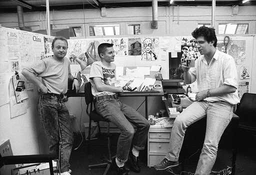 Brett Ewins, Jamie Hewlett, Steve Dillon (L-R) at the Deadline offices.
As Joe Gordon puts it in the Forbidden Planet blog, Ewins was an essential figure in the UK comics scene of the eighties and nineties:
An utterly seminal figure for readers, especially of my generation growing up with 2000 AD and then, perfectly timed for us as we got that bit older, Deadline and other works, experimenting, pushing, improving, changing, pushing the nature of comics artwork and design (and in the case of Deadline, quite simply making comics cool – how well I remember my copies being borrowed by friends at college who hadn’t read a comic since they were kids, a perfect Cool Britannia mix of innovative comics, fresh, hip, hungry talent – being so nurtured by a generous Brett as many of them will tell you – and music and style, it was intoxicating, it was exciting).
Kwezi: South African superheroes
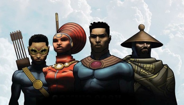
An interesting post on Afropunk.com, about a new South African superhero series, Kwezi:
Created by acclaimed artist Loyiso Mkize, the series is centered on 19 year old Kwezi, a typical South African youngster – immersed in popular youth culture – who develops a connection with his traditional roots,. Mkize says, “It is the journey of a young man. He starts off as an arrogant, opinionated anti-hero who discovers and appreciates his superpowers … the cultural aspect brings him back to his roots.”
Quite a difference from the late seventies Apartheid era Mighty Man, which as Nick Wood describes it, was basically propaganda for the Apartheid state, aimed at the inhabitants of the townships:
But Mighty Man (MM) never challenged any agencies or laws outside the township in which they were set – ostensibly Soweto. A black hero seemingly meant exclusively for black people, his enemies were township gangsters (‘tsotis’), drug Lords (‘dagga merchants’) and generally opponents of peace and ‘law and order’. As Bill Mantlo (1978) states, Mighty Man propounded subservience to laws, non-violence and an anti-gun message (for blacks). With readership targeted to the townships and perhaps priced to ensure affordability to a relatively impoverished community, it was evident Mighty Man was implicitly intent on ensuring compliance to laws – with the underlying message that opponents of ‘law and order’ were invariably gangsters, murderers and, in some instances, ‘communists’. (As Mantlo asserts, a thinly veiled allusion to the then banned African National Congress.)
I ♥ Boulet
The seemingly casual way in which Boulet is able to just sit down and draw a three page story from scratch – no sketches, no mistakes, all done on paper in a single take, is both awe inspiring and slightly sickening.
Sugar, Sugar — Serge Baeken
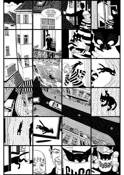
One of the best comics published last year was Serge Baeken’s Sugar, a slice of life comic about the life of a cat and the family he’s adopted into. Cat comics are always problematic because they so easily dive into sentimentality; it’s so easy just to lose yourself in cute anecdotes. Baeken’s work on the other hand has a bite to it. Partially because he recognises the essential truth of having cats, that you have to get used to their death, you share your life with them for, if you’re lucky, ten-fifteen years and then have to get used to their absence.
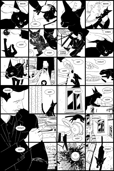
But more than that, it’s the art that keeps it from being sentimental, in its formalism. Baeken keeps the same six by four panel grid throughout the book, but within these panels experiments with layout in a way you don’t see a lot in other comics, certainly not so consistently. So in the early page shown above, you basically have a big overview picture of the street and block of flats the family lives in, intercut in panels, with the narrative set on top of it. It’s hard to know how to read it at first, your eye drawn down the page following the line of the building first, then back up to the first text balloon. Or perhaps down the road in the middle of the picture?
Baeken uses a lot of, if I understand McCloud’s Understanding Comics correctly, “aspect to aspect” transitions between panels, where different aspects of one idea are shown, rather than the passage of time. Here used like a training montage in a movie to show Sugar learning how to “talk” with his humans. I like the way in which the people are drawn slightly more “realistic”, with more lines to their faces than the cats, sleek and stylised.
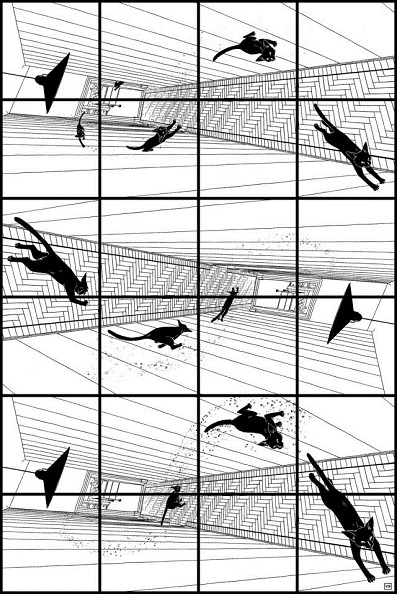
The consistent six by four grid is also great at showing action, with Sugar breaking through the panel borders, background orientation shifting with his own. There’s a touch of Toth, of Hugo Pratt in Baeken’s use of black and white, of shadow. These are pictures you can keep looking at for hours.
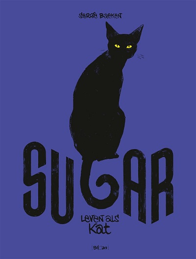
As Wim Lockefeer laments at the Forbidden Planet blog, Sugar hasn’t been translated into English yet, but it wouldn’t need much translation. If you’re even slightly comfortable with French or Dutch, pick this up at your favourite comic store.
