Some random comics links

It shows the essential childishness of much of the American comics industry that a major “newssite” feel the need to censor Guido Crepax’s art, putting those silly little black bars over every side boob visible (but not the heroine’s arse, I see. Hmmm.)

Alan David Doane, one of the web’s earliest comics reviewers/bloggers is quitting comics cold turkey:

The best advice I can give you is, if you find yourself in a similar place as me, unable to enjoy comics and outraged, disgusted or made crazy by the industry and the community, take a breath. Step away. Do something else. Do anything else. You might find it feels better than you could ever have guessed. For me, I am starting to feel free from something that was really becoming bad for me. I feel like I can breathe a little better. It’s a start.

It’s sad to see what should be a hobby, a passion, so poison somebody that they feel the need to purge themselves so drastically, but I’ve been there myself. In 2000 I just stopped buying and even reading comics, completely gotten sick of them. One month I was spending most of my disposable income (and more) on them, the next one I didn’t. I just stopped caring. That’s the risk of having so much of your own identity wrapped up with what is basically still a disposable commodity. Mind, I never entirely gave up on comics, kept my collection, occasionally even bought a new one if I came across something interesting, then got sucked back in thanks to various blogs, but no longer to the extend I was before. There’s no such thing as Club Comix and you shouldn’t try to become a member because it’ll break your heart.

Finally, Darryl Ayo is unhappy with Benjamin Marra’s appropriation of Black history for his revenge fantasy comics:

It is very self-serving and I’ll go as far to say callous about playing in the sandbox of people whose degradation and oppression you do not share. Not writing about black characters or exploring the pain of black people but rather exoticizing the struggle, the pain, the humiliations, the inhumanity of the road to freedom.
The perfect place to start Cerebus

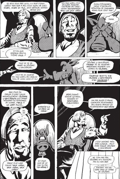
a page from High Society

It’s a strange situation. First you had Dave Sim running a very successful Kickstarter campaign to republish the entire Cerebus series as high quality digital comics, including all the ephemeral content left out of earlier reprints. Then a fire destroyed many of the Cerebus negatives, which, combined with the end through low sales of his Glamourpuss project left Dave Sim pondering the end of his career as a cartoonist. Finally, this triggered a response from Fantagraphics, with head honcho Kim Thompson offering to reprint Cerebus in a more market friendly format:

I’d be perfectly happy to repackage the CEREBUS material in a more bookstore-friendly format than those fucking phone books and give the material the new lease on life it (or at least the first two thirds of it) so richly deserves.

Dave Sim responded and now you have what’s basically a contract negotiation happening in public, which Tom Spurgeon is right to think is absurd. Great fun though and it inevitably leads to thinking about how to start the series. As Kim Thompson put it:

Actually, I feel it absolutely must start at the beginning. CEREBUS is a very complex story and everything builds on what’s come before. The liability is of course that the first several issues are crude and jokey, so you’re not leading with the best work, but if you don’t make these available the stuff that follows is a lot harder to make sense of. That’s a curse of serial comics created by a developing cartoonist.

but there’s a solution to this dillemma and it’s not a difficult one: start with High Society. As Kim Thompson says, the problem with starting reprinting Cerebus from the beginning is that it started out int he late seventies as not that good a parody of Conan the Barbarian as well as other contemporary comics, one of the first wave of creator owned alternative comics, together with series like the Pinis’ Elfquest and Jack Katz The First Kingdom. These first few issues just aren’t that interesting, though Sim develops fast and gets more and more ambitious over time, but they are of a particular time and place and perhaps less interesting if you’re not a hardcore comics fan.

High Society is different. It’s one single story, originally told over twentyfive issues, which if I’m not mistaken was even the longest story told in American comics up to that time. It’s also the story in which Dave Sim came into his potential, complex, cynical, incredibly funny. Best of all, it’s also a story that really needs little to no introduction, no knowledge of what had gone before. All you need is half a page introducing Cerebus, then the story can start with him coing into Iest looking for a room to sleep and expecting to be thrown out of the city, only for everybody treating him with respect and fear and eager to make him happy, which drives him up the wall until he sees a way to profit from it. You don’t really need to know that Dirty Fleagle McGrew and his baby brother Dirty Drew were modelled after Canadian cartoonists Gene and Dan Day to enjoy the story. All you need to know is that it starts off a little bit like Nikolai Gogol’s The Government Inspector and take it from there.

Manara again

J. Caleb Mozzocco, off off Every Day Is Like Wednesday, muses on my own dismissal of Manara’s version of the Scarlet Witch:

Wisse is right, of course, but then, do any characters look like themselves anymore? Close your eyes and imagine just about any superhero character, the Scarlet Witch is a fine example to do with.

[…]

Hell, if Batman and Spider-Man, whose costumes cover somewhere between 90% and 100% of their bodies, look completely different depending on which artist is drawing them. Neither DC nor Marvel use style guides or character bibles or character designs of any kind to dictate how characters look anymore. The Hulk can be anywhere from six feet tall to 20 feet tall, a foot across or eight feet across. Sometimes Spidey’s built like a praying mantis, sometimes like a runner, sometimes a swimmer, sometimes like a competitive body builder.

It doesn’t need to be this way. If you google for images of classic Belgian comics character Spirou, the images you get, whether by Franquin, Fournier or Janry, are recognisably of the same character, even if you omit the bell hop uniform he insists on wearing. (This is also a great example of how “simple” you can make a character design and still make it distinctive). Granted, European comics have always been more stringent in setting guidelines for what their characters look like than American comics have been doing for decades, but even in American comics it’s possible to have widely divergent art styles and still show the same recognisable character.

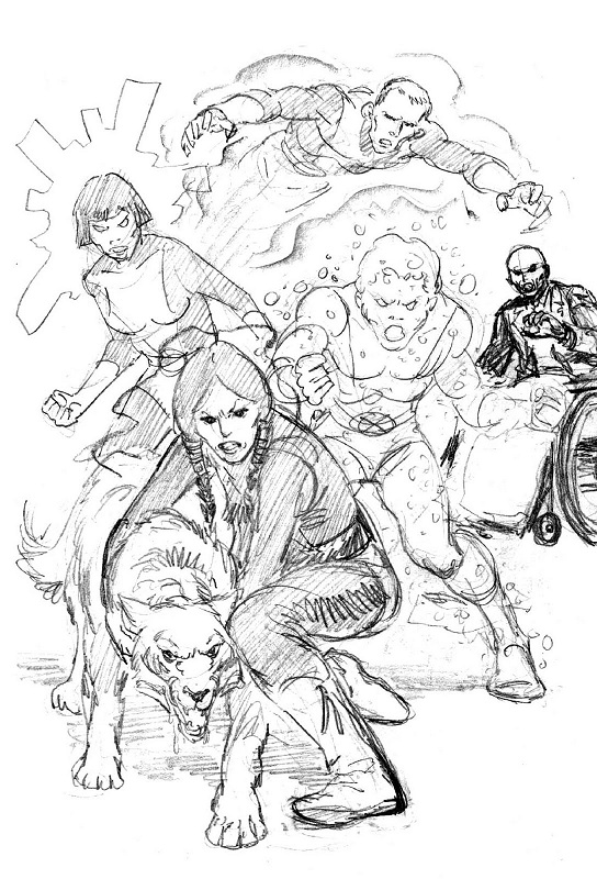
New Mutants by Bob McLeod

Remember the New Mutants? First ongoing X-Men spinoff series, back at a time when that was still unusual, it debuted with a graphic novel (also unusual) written by Chris Claremont (who else) with art by Bob McLeod, who also was the first artist on the series. McLeod was, how shall we say, competent but a bit dull, a bit worthy, a decent realistic draughtsman in the Adams/Byrne tradition. Then, with issue 18, a new artist took the reigns: Bill Sienkiewicz, whose style was quite different. Yet if you look at the McLeod version of the New Mutants and Sienkiewicz’s version below, you can still recognise who’s who.

New Mutants by Bill Sienkiewicz

Art style, interpretation, house style, even the technical competence of an artist can make a hell of a difference in what any given character looks like from issue to issue, but they can still be recognisable as that character even out of uniform (or even nude, as iirc Byrne once said). With Manara’s Scarlet Witch this just isn’t the case: strip her uniform away and she’s just another Manara woman.

slightly less of a sale if you’re not American

fifty dollars shipping for a 3 dollar book at Top Shelf...

To be fair to Top Shelf, their postage remains the same no matter how many books you add, but it does make their annual sale somewhat less attractive than it is for Americans. Which is a shame, as Top Shelf is one of the best comics publishers currently operating. The temptation now is for me to go for everything in the sale that looks even remotely interesting, just to drive the shipping costs per item down…

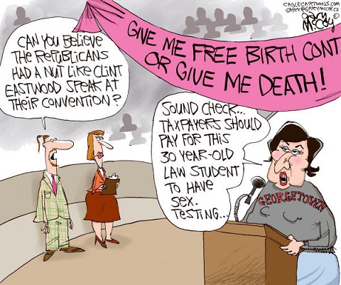
Gary McCoy shows how shitty cartoonists can find work too


It must be hard to be a rightwing cartoonist trying to cover the Democratic convention. Your Democratic and neutral counterpart had a field day with Clint Eastwood’s senior moment talking to an empty chair doing his best grandpa Simpson imitation, but what can you make fun off? Sure, there’s Clinton, but we’ve all long since grown tired of cigar jokes. So what else can you do but lie?

Another hilarious Gary McCoy cartoon about Sandra Fluke

It’s not the first time shitty cartoonist Gary McCoy went after Sandra Fluke, nor the first time he lied about what she said, how she looks or what her intentions are. Just watch her short speech, less than seven minutes and see if you can find out how McCoy goes from that to what he shows in his cartoon. That’s what you have to do if you have no talent but a burning desire to bless the world with your shitty opinions: lie, bear false witnes, iterate.