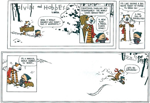
Bill Watterson turns fiftyfour today. Back in uni in 1994-95 our little band of friends read Calvin & Hobbes like previous generations had read Watchmen or Love & rockets. For a while it was the most important comic in the world for us; there were even a couple of occasions of calvinball being played late at night on the streets of Amsterdam…
Comix
Why always Balotelli?
Tom Spurgeon reports about an unfortunate Mario Balotelli cartoon with racist overtones:
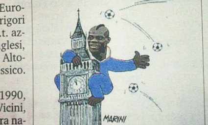
This is the soccer player Mario Balotelli, a very talented and I’d say charismatic player — I know who he is, and I get lost with those guys all the time — who plays in the Premier League for current champions Manchester City and is part of the Italy team currently playing (last I checked) in the Euro 2012 tournament. As one of the spokespeople quoted mentions, his being on the Italian team at all is a big deal, and symbolic, and encouraging for a lot of people, which makes this depiction a bit tragic, really. The usual course of dialogue is taken, it looks like, which makes me think we need a new way to talk about this kind of thing. I wish there a way to cop to the ugliness of depicting someone in that matter that didn’t turn on there not being a machine out there that lets us know what’s in someone’s heart. I don’t see that happening any time soon, though.
You can’t really say much about situations like this. A cartoon is published with, deliberate or accidental racist (or sexist) overtones, people point out that “dude, that’s a bit racist”, cartoonist or newspaper either gets defensive and deny the charges, or get defensive but apologise, people rant about it all on the internet. I’m not sure there is a new way to talk about it, even using Jay smooth’s advice on how to tell people they sound racist, people and institutions both will still get defensive. But it might be interesting to take a stab at how this cartoon was created.
The first thing to remember that this comes from an Italian newspaper and though it may be hard to believe, there is a far greater awareness of racism and racist tropes in America (and to a lesser extent, Britain), than there is in continental Europe. Sure, there are plenty of people who hold ghetto parties with no idea that these are incredibly racist, but there is at least some awareness of what would make for an offensive cartoon; there are also more people willing to complain about it. In short, Americans have been more educated to spot these racist tropes and be offended by them.
Meanwhile, Mario Balotelli is somewhat of a loose cannon. A brilliant strike when wants to be, as witnessed by his performance against Germany tonight, he can also do things like throw darts to his teammates, set fire to his bathroom or wear an A. C. Milan shirt on telly when playing for Inter, somewhat like wearing a Yankees Jersey in Boston, only worse. He’s a great, instinctive football player, but seems to lack smarts some of the time. Which is of course somewhat of a stereotype for talented Black players in any sport, that idea it’s all instinct or innate physical and athletic ability, rather than hard work and intelligence that makes them great.
In any case, the combination makes Balotelli an easy target for jokes at his expense, especially as he often looks a bit of a beleagured figure, wondering “why always me”. So I can see where the King Kong idea comes from: the noble, misunderstood giant harassed by, in this cases, flying footballs. It’s a nice cartoon, if not for the simple fact that equating a Black football player with a giant ape is just a little bit racist. That’s something an American cartoonist would’ve recognised earlier.
Ype + Willem: a funny fumetti
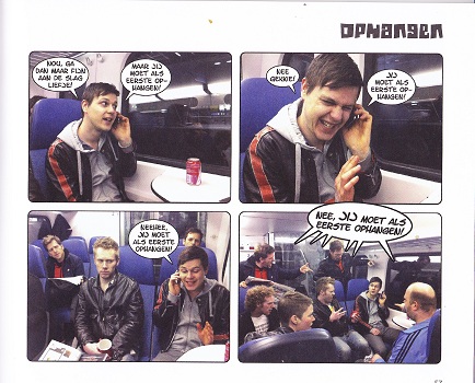
Panel 1: Well, better go back to work then darling — But you have to hangup first.
Panel 2: No silly, you hang up first
Panel 3:Noooo, you hang up first
Panel 4: (entire train): NO, you hang up first
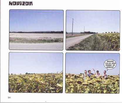
So earlier this month I went to my first comics con in twelve (!) years and the best part of a con is always finding new, interesting comics and cartoonists. Ype Driessen was my biggest discovery of the Haarlem con, even though he’s been active for years, having had a comic in the Dutch newspaper NRC Next for some time. Shows how much out of the loop I am. Luckily his publisher had a stand in Haarlem, the cover of his book caught my eye and I started reading, and, almost immediately, giggling. If reading four strips in a row makes me giggle three times, it must be good.
As you can see from the examples above, Ype Driessen makes fumetti, or photo comics, according to him largely because he can’t really draw. There is a minor tradition in Dutch comics of fumetti gag strips, most notably by Hanco Kolk and Peter de Wit in the eighties, with Mannetje and Mannetje, in which Ype fits nicely. There’s something inherently funny in seeing those hugely exagerrated poses and emotions acted out, but Ype has a sense of humour that would’ve worked just as well in more traditionally, drawn strip. He’s not afraid to make fun of himself or his boyfriend, can be slightly bitchy, but on the whole isn’t very mean and occasionally it’s corny; very corny.
In the interview/mini documentary Ype did for a Dutch broadcaster, shown below, he shows how he creates his comics, with the interviewer as the straight man.
.
Go look at what Tom Spurgeon read in the eighties
The Comics Reporter is the one comix newsblog I read daily, both for roughly keeping up with what’s happening in American comics as because Tom Spurgeon is one of the people whose tastes I trust and have ever since we were both on the old Comix-L e-mail list. This month he has been looking back three decades to what he was reading in the eighties, as a teenager.
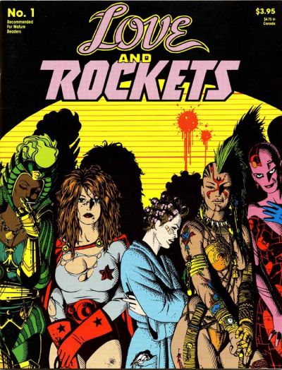
I myself only came to comics slightly later, from about 1987 or so and much of what he talked about I only know from reading about it in Amazing Heroes, comics Scene or Comics Interview, scouring the back issue bins in local comics shops and at local cons all during the nineties and of course from ads in other comics. Love & Rockets especially, the quintessential eighties comic, but I only know it from ads in other comics.
Hard to imagine these days, when we’ve long become accustomed to the idea that anything even halfway decent will be collected eventually, while it’s easier to just list the classic comics anf newspaper strips that haven’t been reprinted yet. But who would’ve thought even ten years ago, let alone thirty, that Fantagraphics would one day be better known as a publisher of high quality archival comics reprint projects than of avant garde alternative comix?
In the eighties and long through the nineties, trade collections were the exception, not the rule and if something was collected, it rarely stayed in print long; except for Watchmen of course. Which mean that the back issue bins were the only way to get any issues or series you missed and it was easier to read about a series like Reid Fleming than actually find it. You had to take what you could get and bugger proper reading order.
Tom’s series of reminiscences are interesting not just as excercises in nostalgia, or as a quick rundown of the better comics of the eighties, but as a contrast to the current state of the medium, in how we talked about them, bought them and looked at them. The traditional weekly comic shop ritual of getting the latest floppies is dying, comics have become more like books, something you buy online or in a general bookstore rather than in a specialised shop. There are good and bad sides to this, but it’s good to see it put into context every now and again.
Tom Spurgeon’s list so far:
Spotted in Arnhem
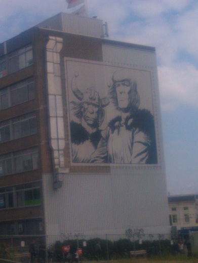
I had to be in Arnhem for work yesterday and spotted this poster on a building opposite the station. As you no doubt have recognised, this is an image of Eric the Noorman, drawn by Hans Kresse, no doubt Holland’s greatest realistic cartoonist, comparable to a Burne Hogarth or Hal Foster in stature. The poster is a remnant from the 2006 celebrations for the 60th anniversary of the first appearance of the Eric de Noorman newspaper strip. More than 21 Kresse drawings and some ten homages from other Dutch cartoonists had been made into art projects and put together around the city, a bit like Brussels also long has had its comics route. Whether or not the other drawings are still in place I don’t know, as I’ve only had to visit the station and a dreary office building in the outskirts of the town.
But still, nice to see one of the comic strip heroes of my youtfh blown up more than life like in the middle of a city.