Genius, Isolated — Dean Mullaney & Bruce Canwell

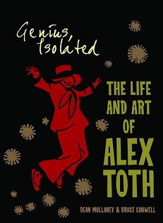
Cover of Genius, Isolated


Genius, Isolated: The Life and Art of Alex Toth
Dean Mullaney & Bruce Canwell
324 pages
published in 2011

If you’re not a hardcore comics nerd you’ve probably never heard of Alex Toth, one of the greatest cartooning geniuses American comics have ever seen. That’s because he never really had a comics series or character that he made his own, but instead had his art scattered over hundreds of seperate assignments for dozens of publishers, often wasted on formulaic, throwaway stories. His true genius lay in his approach to the art form, the way he stripped down cartooning to its essentials, never putting down one more line than was needed. Once you see his artwork you can understand why he’s so revered by his peers, a true “artists’ artist”, but first you needed to find his artwork, which has long been difficult to find other than by hunting through back issue bins.

This has changed in the last decade or so, fortunately, as the American comics field in general has become more aware and interested in its heritage, leading to a flood of high quality reprint projects as well as art books/biographies focusing on individual artists. Toth has had some attention paid to him before, but with Genius, Isolated: The Life and Art of Alex Toth, the first of a trilogy of books devoted to Toth’s life and career there finally is a book that does true justice to Toth’s genius.
Read more

Genius, misused

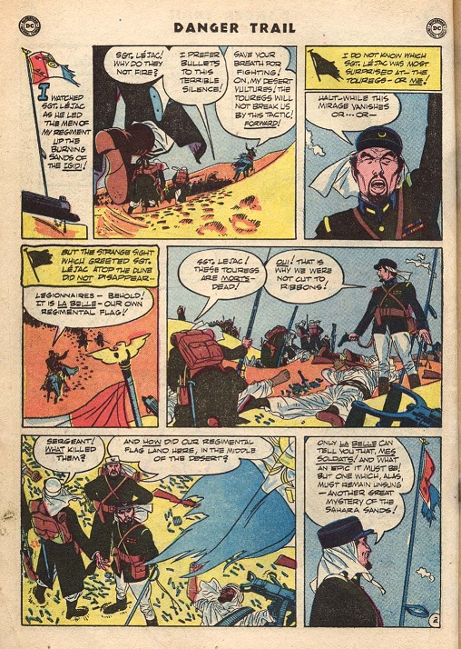
Alex Toth art from Danger Trail 3

I got Genius, Isolated: The Life and Art of Alex Toth last week and have been losing myself in that book and Toth’s art ever since. The page about is one example, seeing that reproduced in a huge format on crisp, clean paper where you can savour each detail makes me giddy with excitement. You cannot help but love Toth’s sense of composition, the ease and elegance he lays out a page, places his panels, places his figures within the panels, always drawing your eyes to the next element. But there also the figures themselves; just look at how the sergeant stands in the middle right panel, or the three legionaires in the bottom left one. Not to mention the line work and the use of black. It’s no wonder that this story, when it came out back in 1950 immediately became a guide and inspiration for almost all other cartoonists working in comics. It’s the perfect example of a style of comics storytelling, a distillation of everything the great comic strip cartoonists like Noel Sickles, Frank Robbins or Milton Caniff had taught Toth, everything he had absorbed looking at their art.

It’s just a shame it’s used in service of such a pedestrian story.

Which could be the theme for Toth’s entire career. He never really had a series or character he was synonymous with, but moved from assignment to assignment, taken meticilous care on each, whether it was Black Canary or Hot Wheels. And that’s a disappointment when you start reading those stories reprinted in Genius, Isolated, rather than just drool over the art. The writing is so dull, or bland or actively bad that it makes the art worse. Comics has always been an unequal partnership of writing and drawing, with good art more able to overcome bad writing than the other way around, and Toth was the greatest example of this.

There is always a tension when talking about comics between story and art, where I sometimes feel that despite our love for it, the art often loses out to the writing. For us fans and critics who ourselves can’t draw our way out of a paper bag, it is after all so much easier to talk about the plot and script than to talk about the nuances of artwork. We’re used to talk about the former, often lack even the vocabulary to talk meaningfully about the latter. A book like Genius, Isolated: The Life and Art of Alex Toth rubs our noses in this deficit. You have to talk about Toth in terms of his art and not worry too much about the banality of the stories he used it on.

Five comfort reads

Five comics I can always turn to when I’m feeling down or unwell.

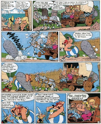
Asterix

1. Asterix. Humour, adventure, incredibly lame puns and it takes the side of the barbarian resistance against the empire. What’s not too like?

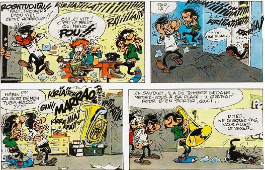
Gaston Lagaffe

2. Gaston Lagaffe. The world’s worst office boy, who spends his entire day avoiding work, experimenting with new, horrible recipes (sardines in apricot jam being one favourite) feeding his equally horrible seagull, inventing new Heath Robinsonesque machines to do things for him he’s too lazy to do himself, or playing battleship with Jules-from-Smith’s-across-the-street over the phone, when Jules is in New York with his boss…. It’s no wonder Gaston never made it in the US, a country where people keep working even if they’re no longer paid.

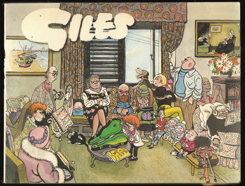
Giles

3. Giles annuals. A year’s worth of gentle satire about the issues of the day, as seen through an unforgettable cast of horrible grans, put-upon fathers, stoic mothers and way too clever kids, with walk-on parts for whichever celebrity that was in the news just then.

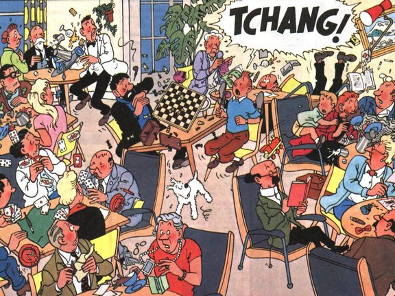
Tintin

4. Tintin. The world’s most viriginial boy reporter and his much more interesting friends going on adventures around the world. Tintin makes the world cozy and orderly.

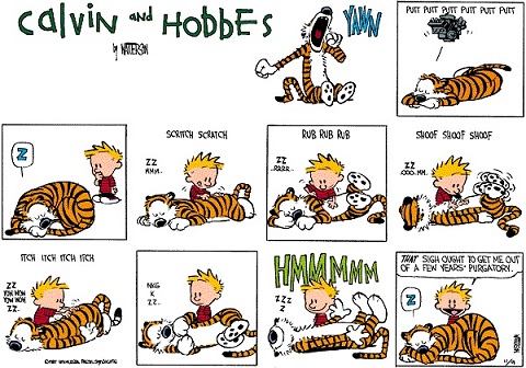
5. Calvin and Hobbes. It’s a magical world. Let’s go exploring.

Moebius


Jean “Moebius” Giraud died today, not entirely unexpected as he was seventytwo years old and was apparantly suffering from cancer, but it’s still a blow to anybody who likes comics. His influence on French comics cannot be underestimated. Together with Jean-Michel Charlier he first created arguably the best western comic ever, Blueberry, which spawned hordes of imitators and kept the western comic genre alive and relevant in Europe when it was dying in America. Then there was his science fiction work, both in comics and as a storyboard artist for various movies, including Alien. He was one of the people (together with Jean Claude Forest, Paul Gillon and of course Jean-Claude Mézières) that from the sixties onward has shaped our vision of what the future should look like.


It’s almost impossible to do proper homage to such a creative genius, so instead I’ve found some videos showing off his drawing skills, with bonus appearances by Joe Kubert and Neal Adams in the top one. All are — unsurprisingly — in French.


Pérez — accent on the first é


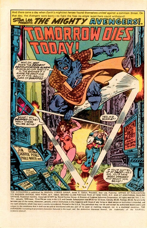
George Pérez splash page from Avengers 167

Tom Spurgeon linked to Diversions of the Groovy Kind‘s series of George Pérez Avengers splash pages (part 2, part 1), amongst which was the one shown above, for Avengers #167. The reason that one stood out for me was because that was the first ever George Pérez artwork I’d ever seen, the first Avengers comic I’d ever read and darn nearly the first superhero comic I’d ever read. For those without an encyclopedic knowledge of seventies Avengers stories, that issue started Jim Shooter’s Korvac Saga and even then Pérez must’ve been known for his willingness to draw huge crowd scenes, for apart from a dozen or so Avengers, it also starts the Guardians of the Galaxy, whose immense time traveling spaceship threatens to lodge the then SHIELD space station out of its orbit. Cue the Avengers, the inevitable misunderstanding/fight between superheroes as Beast is taken for a space monkey by two of the Guardians and the as inevitable flashbacks/shoutouts to earlier adventures as both sets of heroes tell each other what they know about them.

It is the quintessential Bronze Age superhero comic, published at a time and place when the Marvel Universe was still relatively young and not so difficult to comprehend that a few pages of recap couldn’t put readers straight. Continuity between titles had already grown almost as complex as any given titles own continuity, but was still manageable and gave a coherent feel to the Marvel Universe, something that’s summed up in a sequence in the next issue, as Starhawk goes after Korvac and their fight is felt by several of Marvel’s more psi-sensitive characters: Captain Marvel feels something through his cosmic awareness, the Surfer too, while Dr Strange’s meditiation is interrupted and Spider-Man’s spider sense is tingling. It’s only one page with no real impact on the story other than putting it in the context of a wider, shared universe.

That’s the sort of comic I grew up with and this was the comic that planted the seed for me to become a superhero fan. It also made me a Pérez fan, still to me the definitive superhero cartoonist.