(A Suivre) 239 — #aComicaDay (18)

The final issue of (A Suivre) meant it was no longer to be continued, ending a twenty year tradition of publishing mature, literary comics series for people who’d outgrown the traditional magazines.
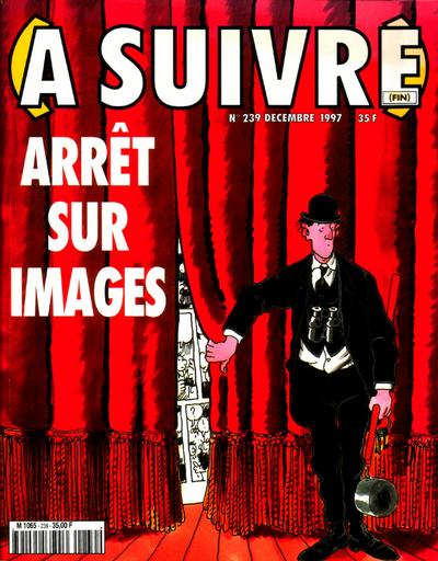
A Tardi drawn character has opened part of a theatrical curtain, behind which a comic can be seen.

Very short recap of Franco-Belgian comics history: at the end of WWII Spirou and Tintin became the dominant comics magazines in the French language, with such luminaries like Franquin, Tillieux, Jijé, Peyo, Tibet, Graton and of course Herge among many others. In the sixties the torch was passed to the French Pilote, where a new generation of cartoonists broke through, among them the Goscinny/Uderzo due whom you may know from a little comic called Asterix. Then in the seventies, Métal hurlant, L’Écho des savanes and Fluide glacial brought a more mature edge, freed from the restrictions of the more commercially orientated older magazines.

In 1978 Casterman, for the most part a fairly traditional publisher which was actually founded at roughlt the same time as the United States (1777), thought that having their own magazine was a good idea. Through it they could promote their various series without being beholden to other publishers as well as share the cost of publication between magazine and album. They also had an audience in mind, an older audience that had grown up reading comics that wanted something more suited to their tastes, if not necessarily the avant-garde works published in Métal hurlant. Grown-up adventure stories perhaps.

(A Suivre) therefore was created as a monthly rather than weekly magazine, which would publish both complete short stories and continuing stories, but in larger chunks than the traditional two pages of the weeklies. The sort of author they were looking for can be found in that last issue: Jacques Tardi, Ted Benoît, François Bourgeon, Loustal/Paringaux, Varenne, Manara. Hugo Pratt, who Casterman had published since 1973 in French, was also a huge inspiration and contributor. These were all people who used the adventure strip genre to examine more literary concerns, more concerned sometimes with the emotional states of their characters than whether they defeated their villains.

This formula worked for some twenty years, from 1977 to 1997, with Casterman publishing successfull stories as albums sometime after they first appeared in (A Suivre). For a few years there was also a Dutch version Wordt Vervolgd, which like the French means To Be Continued. By the mid-nineties though the comics market had changed, with most readers no longer buying magazines but albums. (A Suivre) therefore was no longer sustainable and had to be cancelled. Yet for two decades it had improved and raised the overall level of the Franco-Belgian comics tradition, which is worth something at least.
Johnny Hazard 01 — #aComicaDay (17)

If you only know Frank Robbins from his often terrible fill-in issues at seventies Marvel, this is a good place to re-asses him — had his art been left alone.

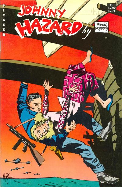
A blonde woman is falling overboard from a junk but Johnny Hazard is there to catch her, hanging off a plank. In the background US 2950s fighter jets are closing in

It was the cover, immediately recognisable as by Howard Chaykin that drew my attention to this comic when I spotted it in the bargain bins at the comic con I went to today. I love me some Chaykin, but I also knew that Johnny Hazard was one of the classic late forties adventure newspaper strips. Launched just a day before D-Day on June 5th, 1944, it ran until 1977, still written and drawn by Robbins, who only quit to retire to Mexico to become a painter…

Robbins got his start on Scorchy Smith, a pioneering adventure strip featuring a pilot for hire, made famous by Noel Sickles. Sickles was hugely influential on the generation of newspaper adventure cartoonists that started in the 1930s and 1940s as well as people like Alex Toth and Howard Chaykin. You can also see that influence in Robbins work on Scorchy Smith, which he did from 1939 until 1944 when he started Johnny Hazard. Like Scorchy Smith, Johnny Hazard was a freelance pilot and after his stint in the military he went to all sorts of exotic places to land himself in trouble.

I think I first encountered his work on some The Human Fly issue, Marvel’s sort lived attempt to make the real live Evil Knievel like stuntman into a superhero. I didn’t like it. It look old fashioned, grotesque even, with his figures being weirdly distorted. Perhaps it was because of the difference between doing a newspaper strip and a comic and what worked in one format not working in the other, but the man has a huge list of comics credits so that’s probably too simplistic. Might just be as simple as his heart not being in it, being semi-retired at that point.

The publisher of this comic, Pioneer Comics, is not one I had heard from before. This came out in 1988 and was supposed to be an ongoing series, but only lasted one issue. The back cover advertises various other famous newspaper adventure strips: Prince Valiant, Rib Kirby, Buz Sawyer, Mandrake, etc. All except one, (Peter ODonnell’s Modesty Blaise) being King Feature Syndicate properties. Looking at their list of publications at the Grand Comics Database, it seems Pioneer Comics only last a year or two, from 1988 to 1990, with only the Prince Valiant series hitting double figures. Were they caught up in the late eighties comics market crash? Did King Features pull the plug on them?

Whatever happened, Andrew Dailies in The comics Journal 126 was not impressed with how they edited their comics: nothing less than artistic rape as he put it. Because instead of presenting these strips as they appeared in the newspapers, with the dailies being normally three or four horizontal panels, the Sunday pages more like a true comic page, these are chopped up, enlarged or cropped to provide a more ‘comic book’ feel. A shame they felt the need to do this, but may explain why they went under so quickly. Who wants to read a classic strip reprint if it has been butchered this much?

Gil Kane’s Savage! — #aComicaDay (16)

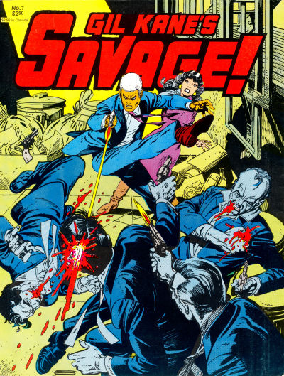
Gil Kane’s Savage! lives up to its name from the very cover, with a level of violence not seen in any comic in 1968 and rarely since.

The white haired Savage is in the middle of the cover, just having kicked a thug so hard he flew backwards while having shot another one in the face, his skull bursting open at the back. A third thug is firing behind him, while on his right the last thig has been shot in the chest and is clutching it in vain. Behind Savage a girl is leaning back in horror.

You can tell this is Gil Kane even without this being Gil Kane’s Savage!, can’t you? The elongated figures, the girl’s face, the way the thug on the left is flung back by Savage’s kick, all tell tale signs of Kane’s art.

And yet it’s a Gil Kane comic that’s a very long way away from what he had became known for, when this was first published in 1968. Famous for co-creating the Silver Age versions of the Green Lantern and The Atom, together with Carmine Infantino laying the foundations for the ‘clean’ style of DC’s Silver Age, it turns out from the interview in the back that he had actually become increasingly frustrated by the limitations of working for DC Comics:


When I first started to do Green Lantern and The Atom, they wouldn’t allow me to do more than oen panel of action, of fighting action in a fight. I wasn’t allowed more than one panel in a story. I used to stretch it and squeeze it, move some of the panels together, which was almost sacrilegious, or I would squeeze in another panel on the page in order to accommodate a second punch in the goddamn fight scene.

With Savage Kane got the freedom to show the violence as long and as rough as he wanted to and he took full advantage. The project was all his, an attempt in 1968 to create a new type of comics magazine, not beholden to the Comics Code Authority, something more mature and sophisticated. Kane got Archie Goodwin to write it, based on his breakdowns and after having discussed the plot with him, but this was mostly his creation.

As a story, it’s very of its time, a spy thriller in which Savage has to stop the planned assassination of the US president by Simon Mace, who had been his commander in WWII. Most of the plot involves Savage trying to find Mace before he can execute his plot only to having to fight off his henchmen. There’s of course Mace’s beautiful daughter with whom he is in love and who he has to protect from her own father.

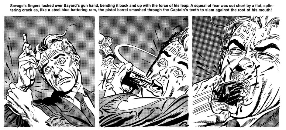
An example of the interior artwork showing Savage grasping the hand of a prison guard holding a gun, ramming the hand with gun and all into the guard's mouth.

The story therefore isn’t why you read this, it’s Kane’s artwork, the cinematographic quality of it, the way he lets himself loose in it. One interesting choice in this is that most of the texual narration is done via captions, with only a limited amount of text balloons in the art itself, reminiscent of Hal Foster’s Prince Valiant. As Kane himself admits, it’s not always successful, as the captions often describe what is already clear from the drawings, rather than supporting them.

Savage was supposed to become an ongoing series, but in 1968 the market wasn’t ready for it. This reprint by Fantagraphics is from 1982, when Fantagraphics had just started to publish its own comics; the back cover advertises the first Love and Rockets. In magazine format, this reprints not just the original, but adds an essay by R. C. Harvey putting it into context as an early forerunner of what Will Eisner would christen “graphic novels”. There are also two interviews with Kane, one by Gary Groth and Mike Catron on Savage and one by Will Eisner going into Kane’s approach to art. This secondary material makes this even more fascinating: Kane is an intelligent, erudite creator so you get some real insight in why he made Savage what it is. And seeing what he looked like, you can understand where his elongated figures come from in his art: dude looks exactly like his own drawings.

The Masked Man 08 — #aComicaDay (15)

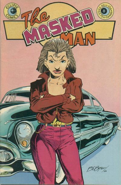
The Masked Man meets his long estranged sister for the first time in years — as she’s busy trying to rob fake antique coins filled with cocaine from the criminal gang that robbed them first! Cover and everything else by B. C. Boyer.

Roxy, the Masked Man's sister is a short haired brunette dressed in pink trousers, a yellow shirt and a brown leather jacket. She stands with her arms folded in front of a car.

The only issue of The Masked Man I ever found. It’s a credit to B. C. Boyer’s storytelling skills that it still made sense despite it being part of a continuous storyline. It sure helps if you can put a proper summary on the first page, something modern comics seems to abhor. The Masked Man, proper name Dick Carstairs, always was a dreamer, wanting to be a champion of justice and now he is. His sister, Roxannne Carstairs was always more realistic and is now a criminal. Why and how they grew up the way they did is shown in this issue and goes all the way back to when they were children.

The Masked Man started off as one of the features in the black and white series Eclipse, the Magazine, published by Eclipse Comics (huh) before continuing in Eclipse Monthly and finally its own series in 1984. This ran until 1988 for a total of twelve issues. The Masked Man was only an ordinary bloke, who one day stopped a robbery and grabbed a mask from a convenient costume store to hide his identity. His adventures are therefore fairly low key, sub-Batman level. I don’t think he ever fought any real supervillains. What set it apart is perhaps its more human view of superheroics, though this seemingly wasn’t enough to make it a success. Publishing only twelve issues in four years cannot have helped either.

The Masked Man is B. C. Boyer’s most significant work, but he would return in the mid-nineties with Hilly Rose from Astro Comics, edited by his old Eclipse editor cat yronwode (who spells her name all lowercase). Apart from that the Grand Comics Database only lists a few scattered credits here and there, with his last work being from 2011. I like his artwork, it has a very Matt Wagner-esque feel to it. The same sort of plasticity to his figures, a similar sort of faces.

As far as I am aware neither The Masked Man nor Hilly Rose has gotten a collection, so the only way to read either is to hunt the back issue bins.

The Horrible Truth About Comics — #aComicaDay (14)

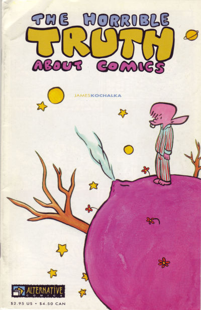
The Horrible Truth About Comics is that comics are good and you can’t stop thinking about them.

A buck toothed elf in pyjamas is standing on a small pink planet

(Fun fact: the first ever mp3s I downloaded were James Kochalka recordings. Some of his songs lived rent free in my head for years.)

I like James Kochalka. An arrogant, abrasive braggart whose grasp exceeds his reach perhaps to some, but goddamn he was right to call craft is the enemy. There’s still no greater advice than what he gave in that original letter to The Comics Journal:


What every creator should do, must do, is use the skills they have right now. A great masterpiece is within reach if only your will power is strong enough (just like Green Lantern). Just look within yourself and say what you have to say.

It’s exactly what he does with his comics and music. He doesn’t worry about whether his singing or art is good enough, he puts pen to paper and puts it out there. A very punk attitude that has worked well for him over the years. But that same attitude also meant that this simple message led to a years long controversy in the pages of The Comics Journal with people like Jeff Devine and Jim Woodring no less coming down on the side of craft being essential. Reading it back, you feel that they completely misread what Kochalka was arguing but also that he was deliberately fanning this misunderstanding in his follow-up messages. It became a flamewar all over alternative comics space, where to be honest the fight was more interesting than the outcome because obviously both sides had good points.

The Horrible Truth About Comics came out in 1999 and is a 32 page monologue about Kochalka’s views on art and comics making, which repeats some of the points made in “craft is the enemy” but more coherent and less obnoxiously. I think it was advertised at the time as being Kochalka’s ultimate statement on these themes, a final rebuttal to his enemies. At heart though it’s a glorious celebration of the possibilities of making comics, something that gives me joy every time I read it.