Pérez — accent on the first é


George Pérez splash page from Avengers 167

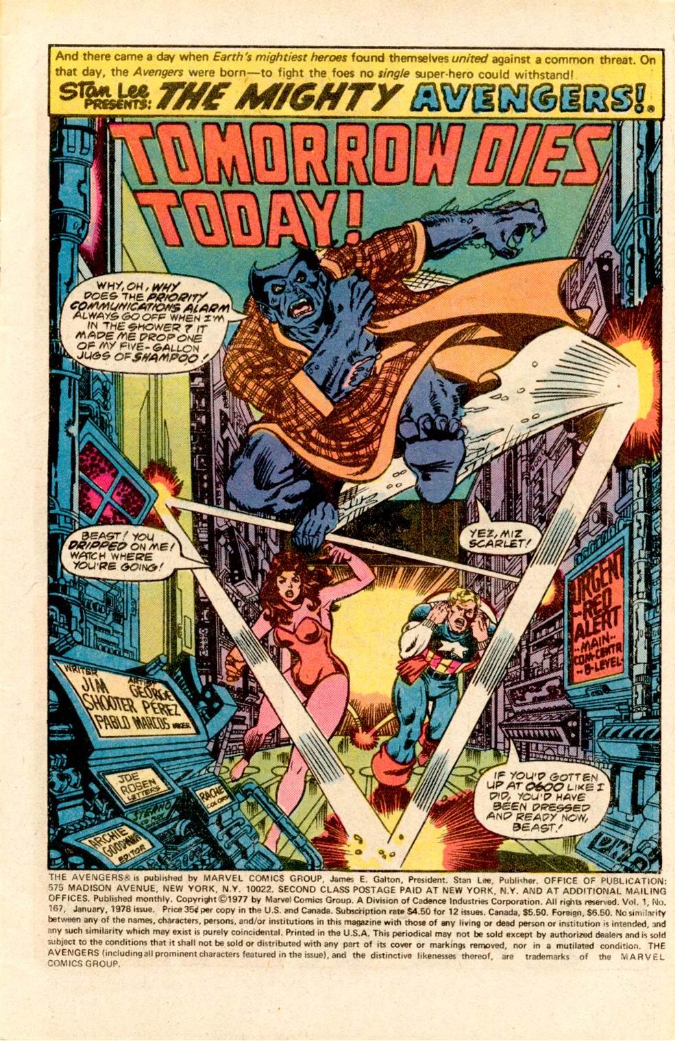
Tom Spurgeon linked to Diversions of the Groovy Kind‘s series of George Pérez Avengers splash pages (part 2, part 1), amongst which was the one shown above, for Avengers #167. The reason that one stood out for me was because that was the first ever George Pérez artwork I’d ever seen, the first Avengers comic I’d ever read and darn nearly the first superhero comic I’d ever read. For those without an encyclopedic knowledge of seventies Avengers stories, that issue started Jim Shooter’s Korvac Saga and even then Pérez must’ve been known for his willingness to draw huge crowd scenes, for apart from a dozen or so Avengers, it also starts the Guardians of the Galaxy, whose immense time traveling spaceship threatens to lodge the then SHIELD space station out of its orbit. Cue the Avengers, the inevitable misunderstanding/fight between superheroes as Beast is taken for a space monkey by two of the Guardians and the as inevitable flashbacks/shoutouts to earlier adventures as both sets of heroes tell each other what they know about them.

It is the quintessential Bronze Age superhero comic, published at a time and place when the Marvel Universe was still relatively young and not so difficult to comprehend that a few pages of recap couldn’t put readers straight. Continuity between titles had already grown almost as complex as any given titles own continuity, but was still manageable and gave a coherent feel to the Marvel Universe, something that’s summed up in a sequence in the next issue, as Starhawk goes after Korvac and their fight is felt by several of Marvel’s more psi-sensitive characters: Captain Marvel feels something through his cosmic awareness, the Surfer too, while Dr Strange’s meditiation is interrupted and Spider-Man’s spider sense is tingling. It’s only one page with no real impact on the story other than putting it in the context of a wider, shared universe.

That’s the sort of comic I grew up with and this was the comic that planted the seed for me to become a superhero fan. It also made me a Pérez fan, still to me the definitive superhero cartoonist.

Fifty Essentials in Fifty Days 20: Essential OHOTMU Deluxe Edition Vol. 1

cover of Essential OHOTMU Deluxe Edition Vol. 1


Essential OHOTMU Deluxe Edition Vol. 1
Mark Gruenwald, Peter Sanderson and friends
Reprints: OHOTMU Deluxe 1-7 (December 1985 – June 1986)
Get this for: State of the Marvel Universe ’86 — Four stars

So back in 1982 Mark Gruenwald and co concieved the Official Handbook of the Marvel Universe detailing all the most important characters, places and things concieved up in some twenty years of Marvel Comics. It had run its course by mid-1984 and a year later the need was felt for an update. Hence this, the Official Handbook of the Marvel Universe, Deluxe Edition. Instead of the standard 32 pages of the first edition, it had 64 pages per issue with no ads, room to expand individual entries, cover more characters, up the text size and most importantly, use more artwork.

It was the latter that drove George Perez away from Marvel.

Which seems strange, until you know that all that extra artwork was, unlike the main art in a given entry, was not new, but copied and pasted from older comics, uncredited and unpaid for. Once Perez saw that this had happened to his artwork as well, he got so angry he refused to work for Marvel ever again. Since his main series at the time was New Teen Titans for DC this wasn’t that hard a gesture, but it did mean that the fourth part of Perez and Macchio’s Black Widow serial in Marvel Fanfare (which had been commissioned years earlier but never saw print) had to make do with an Arthur Adams cover rather than new art by Perez. He would come back to Marvel in the early nineties, after Jim Shooter had left, when ironically it was DC that was dicking him around…

Anyway, it’s all water under the bridge but it did make this version of OHOTMU a bit controversial. Marvel has learned from this: in the modern series reprinted art is all neatly credited and I assume paid for as well.

The format of the series is no different from the first: entries in alphabetic order, with corrections, glossaries and other editorial content on the inside covers. Speaking of which, the wraparound covers by John Byrne are beautiful, almost as good as Perez’s covers for the DC equivalent, Who’s Who in the DC Universe. I first encountered these covers in a Marvel Comics diary/calender published in Holland, where they were used as the background to the diary pages. Back then I could name perhaps one in ten of the characters shown but they were fascinating nonetheless.

The entries are longer and feature more obscure figures as well as the obvious ones, though luckily total time wasters like (ugh) Shamrock are not carried over from the first series. Much of the added length of many entries comes from giving those characters that deserve it longer histories, recapping the highs and lows of their careers. More attention is also paid to powers and abilities, in an attempt to standarise and systemise them, though to be honest little attention to these efforts was ever paid to them in the real comics. For geeks like me though this stuff is gold dust. No longer do you need to argue who’s stronger, the Hulk or the Abomination: the Hulk is Class Strength 100, meaning he can bench press a hundred tons regularly, while the Abomination might be able to do that once, but not in succession.

What I also like about this series, especially when I wasn’t that familiar with the Marvel Universe yet, was seeing all these characters and getting some of their backstory. It showed what a weird and wonderful place the Marvel Universe was. For those who are not quite that geeky, this is far from an essential purchase of course, but still a good snapshot of mid-eighties Marvel.