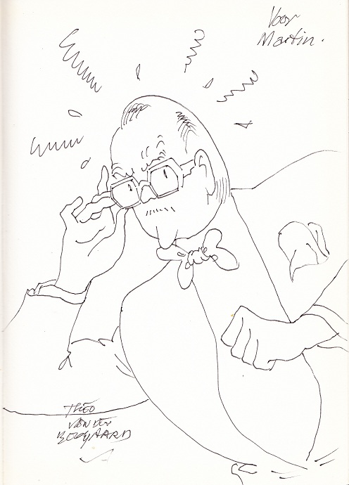
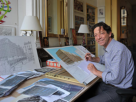
Another sketch gotten at the Haarlem Stripdagen, by Theo van den Boogaard, one of the founders of the Dutch underground. Below is him sketching it.
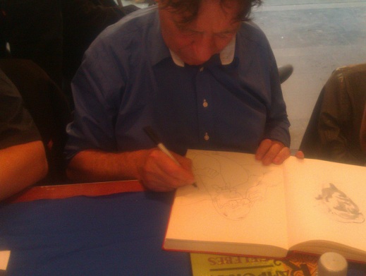
Another sketch gotten at the Haarlem Stripdagen, by Theo van den Boogaard, one of the founders of the Dutch underground. Below is him sketching it.
In the eighties Dutch cartoonist Theo van den Boogaard became popular all over Europe with his Sjef van Oekel comic, a classic clear line gag strip subverted by an anarchistic, scatalogical sense of humour. I talked about him last year, when there was an exhibition of his cartoons and architectural drawings in the Amsterdam City Archives. While Sjef van Oekel, despite its anarchistic undertones was a thoroughly commercial comic, van den Boogaard had actually made his reputation in the seventies as part of Holland’s underground scene, with a series of highly personal comics, of which De Ideograaf is one.
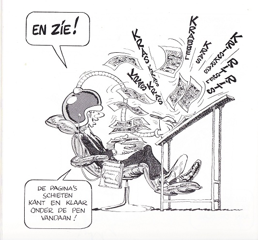
The plot is simple: van den Boogaard, fed up with all the hassle of going from idea to comic, invents a “simple extension of the lie detector” to skip all that tedious writing and penciling and inking and skip directly from the ideas in his head to the finished comic. Van den Boogaard then muses on what this invention would mean for society as a whole, as everybody, not just cartoonists, but other artists as well will be able to realise their ideas perfectly.
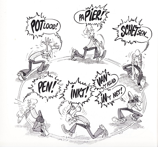
What’s great about this is the execution. Van den Boogaard draws in a lighthearted, big footed, big nosed, super exaggerated style, with no panel borders and lots of page filling images as well as several huge two page spreads. I would’ve included such a spread, was it not that my scanner was too small for it; i think the two examples above and below of van den Boogaard’s art give enough of a picture in any case. It’s all incredibly groovy, somewhat reminiscent of e.g. Harvey Kurtzmann or some of the great underground caricaturists (Crumb in his more playful moods, or a Howard Cruse), but also of Franquin.
It’s also very meta; the first quarter of the story has van den Boogaard blowing off steam about the slow production of the very comic it appears in, and throughout he keeps up this knowning wink. Unlike most attempts at being meta it doesn’t come off as forced, as he’s smart enough to trust the reader, doesn’t hit you over the head with it.
To make a long story short, The Ideograaf is one of those rare comics that makes you happy reading it, both for the art and the story as it’s so damn joyfull. A shame it’s out of print when van den Boogaard’s more cynical commercial offerings are still widely available.
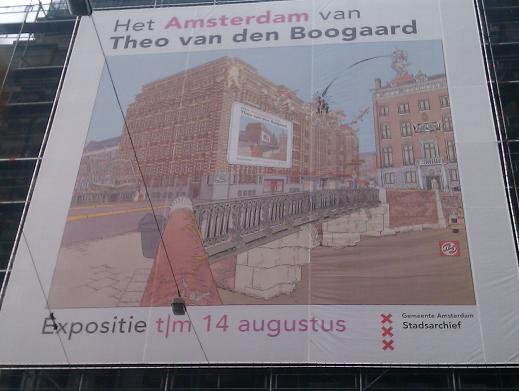
So today I went to the Theo van den Boogaard exhibition in the Amsterdam city Archives, which was small but brilliant. Theo van den Boogaard is one of Holland’s best cartoonists, having started his career in the sixties, working for various counterculture (so to speak) magazines creating a series of ground and taboo breaking comics. His greatest succes however was with Sjef van Oekel, an incredibly anarchic, chaotic comic strip drawn in what is perhaps the most disciplined art style possible, the Ligne Claire or clear line. Sjef van Oekel, who started out as a character in a Dutch satirical television show, is a middle aged and self absorbed, doesn’t quite think like normal people and his actions usually cause chaos and destruction all around him. What makes it work is the clear, precise ligne claire style Theo van den Boogaard draws his adventures in, set against the background of the immediately recognisable city of Amsterdam. His drawings are chock ful of detail, yet you get them immediately. His drawing style also did well on various advertising posters and artwork he did for companies like the Dutch railways and other public transport providers, as well as the city of Amsterdam.
All of which was on show in the exhibition, which put the focus on the city of Amsterdam as van den Boogaard portrays it. So you had the various adverts showcasing new railway stations and such, but also large extracts of the Sjef van Oekel strips showing how he had used Amsterdam in those. Alongside those there were also other pieces of artwork that don’t feature Amsterdam as much but provide some context for his career. It’s not just the finished artwork on display either: for some of the key drawings the working sketches and various stages and research material is shown as well. It’s great to see all this art shown actual size and up close, seeing all the details less noticable when published in a smaller format.
What struck me about it is not just the meticulous way in which van den Boogaard works, but also how he’s not afraid to warp the city when he needs to. He’s not stuck to his research or the need to keep the city real, but sticks bits and pieces together when he needs to, in the same way Hollywood sometimes uses bits of Vancouver to be New York say, but much more believable. Van den Boogaard has that ability to make you see the city through his eyes, so that when you walk out of the exhibition you see Amsterdam all clear lines and looking exactly as if van den Boogaard had drawn it.
Against this realistic background van den Boogaard puts his larger than life characters, constantly in movement, always slightly exaggerated even when standing still. This is of course a general characteristic of clear line strips, but unlike some van den Boogaard’s characters always look as if they fit the decor. His characters look as if they could walk off the page immediately and not look out of place in the real Amsterdam..
The exhibition is small and can be gotten through in an hour, but its focus on Amsterdam, on how van den Boogart shows the city and uses the city, manipulates and mutates the city for his own needs makes this exhibition work. If you are in Amsterdam sometime before the 14th August, are interested in comics and have had enough of all the highbrow musea, admission is only five euros and it’ll give you much to think about it. Be sure to also pick up the book of the exhibition.