Diversions of the Groovy Kind has a series of splashpages from Marvel titles published in February 1971, exactly forty years ago. Some great art there, but the one that really grabbed my attention is the one above, by Don Heck (and Sal Buscema) for the Black Widow feature in Amazing Adventures. Heck is never really been one of my favourite artists, but having seen his work on early Avengers and Iron Man in the various Marvel Essential collections I read last year I gained a new respect for him.
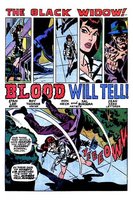
The page above is a good reason why. Most of the other splashpages featured just consist of one single, dramatic image, but Heck[1] has chosen not to do this. Instead, he puts a sequence of five, narrow, vertical panels above the title, building up to the payoff below the title, as the Widow judochops her stalker with such force his feet break through the panel border. Not a single panel is wasted here, each adding a new element, contributing to the tension. The first panel shows the widow in medium focus walking past a building, then we see a close up of shoes, clearly not the Widow’s, followed by an overhead shot showing the Widow walking as well as the lower legs of her stalker, in shadow. Next a reaction shot, as it’s clear the Widow has noticed him, then the menace as the guy sticks out his hand with a sneer on his face, followed by the payoff, as she quickly overpowers him, which is also the first time we get both dialogue and sound effects. Elegant, simple, done with the least amount of effort, seemingly nothing special happens on this page, it’s a sequence we’ll have seen dozens of times before, but it’s drawn with such craft by an artist who clearly thinks in page layout as well as images.
[1] Of course, both Roy Thomas, who has written the script Heck will have had to follow to draw this page and Sal Buscema, who inked Heck’s layouts have something to do with the choices made here as well, but I assume it was Heck who translated Thomas’ script, who made these layout choices.
vollsticks
February 7, 2011 at 8:41 pmSome of the early Thor stuff drawn by Heck is kind of sketchy and a little bit unfinished-looking in some places and I know that he generally wasn’t held in high regard by comics fans. His stuff just wasn’t as pretty as a Sinnott or Stone or even a Coletta-inked Kirby comic. But I think Heck’s fundamental skills as a draughtsman are glaringly apparent and hold up as well as–in some places “technically” better than– Kirby from the same period. The example you chose really shows how Heck’s rougher edges could be tempered effectively by the right inker without losing his power. As a caveat–I love his sketchier-looking stuff, too! Some of those early Thor’s–with the mallet with the really long handle–brilliant!
Great little post, sir–I keep meaning to get some of those early “Essential” Avengers volumes–now I know there’s some Heck in ’em, I’m there!
Ant