Sleutelmomenten: Joost Swarte — Ward Wijndelts

Cover of Sleutelmomenten


Sleutelmomenten: Joost Swarte
Ward Wijndelts
223 pages
published in 2024

Joost Swarte is the Netherlands’ internationally most famous cartoonist, whose work has been translated from Dutch into English, French and other languages since the seventies. His Modern Papier series was, together with Tante Leny Presenteert the first Dutch underground comic, but he also did work for Dutch school magazine Jippo at the same time. Organiser of the 1977 Herge exhibition in Rotterdam, he coined the term “De Klare Lijn/Ligne Claire/Clear Line” for the art style practised by Herge and similar artists like Bob de Moor and Edgar Jacobs. This is also the style Swarte uses for his own comics, in a more ironic, satirical fashion that fitted the more cynical seventies. Not just content with being a cartoonist, he designed a series of charity stamps for the Dutch post office in the eighties and later on would collaborate with an architectural office to design a new theatre building in Haarlem. There he also founded the bi-annual Haarlem Stripfestival. In more recent years he started working for The New Yorker. More than enough material to write a biography about him therefore.

Yet as the title, Sleutelmomenten (Key Moments) already indicates, this is not a true biography of Joost Swarte. Rather, it’s a guided tour past the defining moments of his life, as put to paper by a sympathetic and largely uncritical writer. As he explains in the post-script, Wijndelts has based this book almost exclusively on a series of conversations with Swarte, so it’s his perspective and memory we see this moments through. Which means that what Wijndelts writes about is not necessarily what happened, but rather what Joost Swarte remembered happening, or even what he wishes to remember about what happened. Some of the moments represented here are also so well known and oft retold that what we get here is Joost Swarte retelling events that have become well worn anecdotes. But is this a problem?

If you read this as uncritically as Wijndelts has seemingly written it, it might be. But if you treat it as what it is, a semi-autobiographical trip down memory lane by Swarte there’s still a lot of value to be found in this. Especially in the first half of Sleutelmomenten, which is about Swarte’s youth, his first steps into making comics himself as well as the people who inspired him. Swarte across over as somebody who was only ever good at doing the things that genuinely interested him, intelligent but without the temperament to do well in school. He has a supportive family who encourages him to take art classes as a child. Once he finishes high school and becomes a student, there was still the liberty to, well, faff about at university without needing to finish your education according to the strict timelines that would’ve been expected today. Without this support from both family and society as a whole Swarte may have never become the artist he was.

Once the book moves into more familiar territory, as Swarte debuts as a comics artist, things become a little less interesting. Most of what Wijndelts writes about you’d already would’ve known if you’re interested in Swarte and his career, largely following the line I sketched in the introductory paragraph above. The exception is with his later, non-comics work, like his design of the Toneelschuur building in Haarlem. This is an aspect of Swarte’s career that’s less well known, especially outside of the Netherlands, so it’s good to see it included here. Wijndelts is a good enough writer that even the chapters retelling already well known stories remain entertaining and occasionally unearth a new nugget of information. New to me e.g. was that in 1983 Swarte was asked by Martin Lodewijk to develop a detective series for a Dutch magazine; nothing in the end came of it.

Sleutelmomenten therefore is a slight, entertaining look at the life of one of The Netherlands greatest comics talents. Worth reading, but a true biography of Swarte is, as Wijndelts himself also admits, still sorely needed.
The British Character — Pont

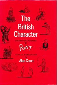
Cover of The British Character


The British Character
Pont
120 pages
published in 1938

It must’ve been a decade ago that Sandra found this book in a secondhand bookstore in Middelburg. She liked the cartoons, but since she had read it by the time I was done browsing, she didn’t think it worth buying. I disagreed and bought it for her as a present. She took it back to Plymouth with her, brought it back over when we started living together and today my eye fell on it when I was looking for something to read from among her books. It reminded me of how she liked several of the cartoons enough to make high quality copies of them, to hang on our walls. She recognised herself in them, some essential quirks of the British character she also possessed. Looking at these cartoons now I can’t help but seen Sandra in them.

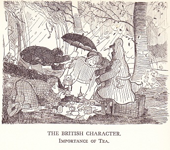
The importance of tea

Pont is a pseudonym for Graham Laidler, a cartoonist who mainly worked for Punch, starting his “British Character” series there in 1936, with this collection first having been published two years later, and multiple times since. He himself had only a short time to enjoy his success, as he died in 1940 at age thirtytwo. He had been ill a long time, his sickness being the reason he turned to cartooning in the first place, rather than the architectorial drawing he had been trained for. Though his cartoons are very much of his time, they do touch on universal aspects of the British character.

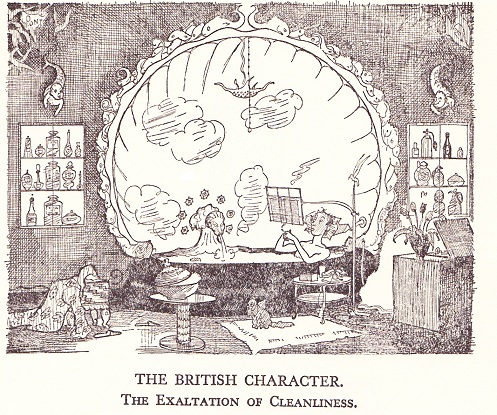
The exhultation of cleanliness

But therein lies a paradox because, as Alan Coren indicates in his introduction to this edition, the people Pont depicts in his cartoons are stereotypes, hoary even at the time he first put them to paper. His character studies are largely limited to that of one class only, draw a caricature of the upper classes as existing in the English popular imagination, if not quite in reality. The people in them, in the midst of the great depression do not have jobs to worry about, or anything else really. Pont’s humour lies in gently mocking their pretensions, their idiosyncrasies and petty concerns. There is no anger or judgment in them.

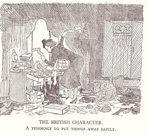
A tendency to put things away safely

To be honest, many of the examples of this socalled British character are far more universal than that, familiar to culturally middle class people — like myself– all over the world. Yet, when looked at in total, there is a Britishness, a limited sort of Britishness perhaps, but a Britishness still, that speaks out of these cartoons. A very radio 4 sort of Britishness.

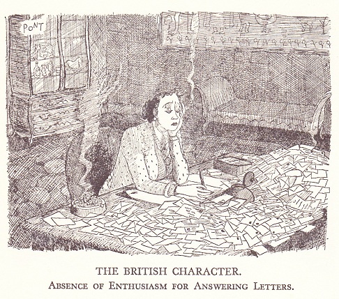
Absence of enthusiasm for answering letters

As you can see from the examples, they’re all done in pen ink, with a lot of fiddly dark lines and lots and lots of details, yet still with a certain looseness in the lines. The pictures all are a bit on the gloomy side, of course matching the stereotypical weather in the British isles. They’re quite lovely in their way. Almost every page in the book also has little side sketches, in a much looser style. So if you find a copy of this book, get it.

Genius, Isolated — Dean Mullaney & Bruce Canwell

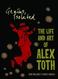
Cover of Genius, Isolated


Genius, Isolated: The Life and Art of Alex Toth
Dean Mullaney & Bruce Canwell
324 pages
published in 2011

If you’re not a hardcore comics nerd you’ve probably never heard of Alex Toth, one of the greatest cartooning geniuses American comics have ever seen. That’s because he never really had a comics series or character that he made his own, but instead had his art scattered over hundreds of seperate assignments for dozens of publishers, often wasted on formulaic, throwaway stories. His true genius lay in his approach to the art form, the way he stripped down cartooning to its essentials, never putting down one more line than was needed. Once you see his artwork you can understand why he’s so revered by his peers, a true “artists’ artist”, but first you needed to find his artwork, which has long been difficult to find other than by hunting through back issue bins.

This has changed in the last decade or so, fortunately, as the American comics field in general has become more aware and interested in its heritage, leading to a flood of high quality reprint projects as well as art books/biographies focusing on individual artists. Toth has had some attention paid to him before, but with Genius, Isolated: The Life and Art of Alex Toth, the first of a trilogy of books devoted to Toth’s life and career there finally is a book that does true justice to Toth’s genius.

It does so by being more than just a lavishly produced, gorgeous looking coffee table book and biography but also a showcase for Toth’s artwork. As many or more pages are devoted to reproducing Toth’s art, including a huge selection of complete stories as there are to talking about his art; there are only a few pages entirely devoid of his artwork. It’s this that makes Genius, Isolated such an important book, a demonstration of Toth’s artistic genius as well as an archive of stories that haven’t been seen since their first publication decades ago. Such showcases are important to establish an artist’s reputation, as they provide both a convenient sampler for people new to them, as well as a signal that yes, this artist is important enough to merit a fifty dollar art book.

There is a downside to publishing so many complete stories in this book, as I explained a few days ago at Wis[s]e Words, which is that you can’t help but notice how many of the stories Toth did his best work on were, to be honest, not nearly as well written as Toth illustrated them. If, like me, you tend to focus more on the story than the art when reading comics, it can be a handicap in appreciating Toth’s work.

Fortunately Toth’s art is strong enough to overcome this handicap; you can’t help but fall in love with it. What characterises it is his use of strong, angular lines to sketch his figures, the use of black shapes, silhouettes and shadow both to create mood and to compose his pages and panels, the economical way in which he conveys emotion with just a few lines and how he places his characters to guide your eye over the pages. Composition is the key word with Toth; at each level — panel, page, story — he excels in creating a holistic experience and make it look natural. Apart from that, his artwork at his best is drop dead gorgeous, the kind of art that leaves you staring at it open mouthed in sheer admiration.

The text that goes along with Toth’s artwork concentrates on the artist’s life and career, providing a decent biography, though not really much more than that. It’s good enough as it goes, but I would’ve liked to see more discussion of Toth’s art and how he created it. There is some of that, but not enough for my liking. Hopefully we’ll see more of that in the next two volumes in the series.