Sexual c*nt-honey

An early contender for the worst sex scene in literature 2010 award (Literature is used here in its widest possible meaning.):

She towered over him, aggressive, powerful, dominant, totally in charge, her jewelled hands on naked, swaying, circling hips, the smile of the jailer etched on her face as she eyed him like a cat eyes a cornered mouse. Saark’s gaze slowly strayed, from the sexual cunt-honey dripping from her quivering vulva, to the large rubies on the rings that circled her fingers.

From a very entertaining review of Andy Remic’s Kell’s Legend. Remic you may remember was last seen whinging about too many negative reviews; now we know why.

Hard cases make bad philosophy

Crooked Timber is going through one of its periodic spats about philosophy and especially about the use of socalled trolley problems to tease out universal principles of morality. A trolley problem is a classic philosophical thought experiment which goes something like this: “A trolley is running out of control down a track. In its path are 5 people who have been tied to the track by the mad philosopher. Fortunately, you can flip a switch, which will lead the trolley down a different track to safety. Unfortunately, there is a single person tied to that track. Should you flip the switch?” Over time these sorts of experiments have gotten more complicated and less real, which is why every so often there will be yet another 100+ comment thread on Crooked Timber on them. Now this isn’t something I’d normally would pay much attention to, but Christ Bertram’s comment as to why these examples have to be extreme struck me:

There’s a perfectly good reason why the examples we use are “far fetched”, “ludicrous” etc. It is because we are often trying to test our commitment to some principle or other which is alleged to hold universally. A principle wouldn’t even be a prima facie candidate for such universal status if it failed to deliver the right answer in the central cases, so we are bound to seek out more exotic examples – it is the way of the dialectic.

The problem with that approach is that you end up spending a lot of time and effort into constructing an extreme enough edge case to satisfy the need for universality and yet more time and effort into defending your construct against critics pointing out its flaws, leaving the consideration of the principle in question as at best a secondary activity [1]. What’s more, by forcing yourself into creating such an extreme case there’s always the danger that you’re building it towards a preferred outcome—either to prove or disprove universality.

It’s like software testing. For any moderately complex piece of software it’s easy to spent a lot of time and money creating test cases that try the limits of the system, but which are rarely or never encountered “in the wild” and which say little about the more mainstream circumstances with which the software needs to work. [2]

[1] Classic science fiction example: The Cold Equations
[2] Like the financial/payment system at a Big Government Facility I know that has provisions for combinations of benefit payouts and such that are throroughly tested with each new release but have never been used in production…

authenticity vs gender balance

Steve Poole blogs about Publishers Weekly‘s oddly womenless top ten best books of 2009 to note a particular phrase of speech, as is his wont. What niggled at me was his last paragraph:

If you make a list of your favourite books of the year and then notice that they are all written by men, should you remove some of the books and insert some written by women? If you don’t do so, are you “ignoring gender” or “excluding women”?

Then it struck me. What this paragraph does is to create a contrast between the spontaneous act of listing your favourite books of the years and the artificial act of genderbalancing it. It presupposes both that the original list would be the “real” one, reflecting the genuine tastes of the PW editors and unsullied by other concerns, while the adjusted list would have phonies on it, books only chosen because they written by women. Not that Steve meant it that way of course, but it is the sort of assumption that’s always in the background of this kind of gender (or any other kind of) equality discussions. It both ignores the reality of how a list like this is created and denigrates gender balancing such a list as inauthentic.

Your Happening World (6)

Graham Sleight on the appeal and limitations of Hal Clement’s science fiction:

However simple the central conceit, “Uncommon Sense” nicely demonstrates the central idea of Clement’s fiction: investigating the world will enable you to make sense of it and, very often, benefit in the process. Cunningham may look, superficially, like a Heinleinesque Competent Man, but he differs in having the kind of detailed curiosity I’ve described. Heinlein’s heroes tend to win out because of the strength of their belief, because they’re right but the world doesn’t know it (quite) yet. Clement’s heroes tend to win out because their faith in empiricism is ultimately rewarded. (The unspoken axiom there, of course, is that empiricisim is sufficient to solve any problems that may come along. It’s no surprise, then, that Clement’s stories tend to be arranged so that this indeed is the case. The question of how often a situation like the one in “Uncommon Sense” might arise in everyday life is not addressed.) There are a couple more arguments that might be made against Clement’s worldview. First is that empiricism tends to trump all other values — contemporary readers might balk a little at the scene in “Uncommon Sense” where he kills the crab-creatures just on the off-chance that he might find out things about them. The second is that he’s not particularly interested in character. Characters have traits, to be sure — Cunningham is determined, the two men who have highjacked his ship are “villains.” But any idea of a more rounded selfhood is very rare in Clement.

Other science fiction writers that fit this description are Arthur C. Clarke, Isaac Asimov and Robert Forward, amongst others (yes, they tend to be male). That’s the sort of science fiction I grew up with, somewhat lacking perhaps in the characterisation or literary departments, but as Graham says, promoting a worldview in which experimentation and rational thought are key to understanding the universe, where it didn’t matter what your shape was, as long as you could talk the language of Science (even if most of the heroes of these stories were of solid Anglosaxon stock). It’s a kind of science fiction that can’t really be written anymore today, as we expect more than just clever puzzles in our stories. Nevertheless there is value in them; the best of them show you how scientific reasoning works, that the universe can be understood and reasoned with. Hal Clement was a master at this and you could do worse than to check out his best story, Mission of Gravity, in which the planet Mesklin, with its oblong shape and gravity varying from 3g at the equator to 275 or so g at the poles is the star, a great example of worldbuilding grounded in science as well as how to make a didactic story worth reading.

Meanwhile Margaret Atwood would like you to know that she doesn’t write that icky science fiction. Whatever.

Moving on, this series of photographs of dead albatross chicks stuffed full with plastic is, as Paul McAuley says, very Ballardian, but also upsetting. These albatrosses nest at Midway in the middle of the Pacific and when the parent birds set out to find food for their chicks, they instead return home with plastic garbage, from the huge floating plastic trash fields that collect in the North Pacific, trapped by the North Pacific Gyre. This is actually a problem that afflicts every ocean, with no easy solution in sight.


Ballardian was also a word used on the BBC4’s synthpop weekend, as more than one early eighties synth pioneers explained the inspiration they got from Ballard, something I was sure Owen would’ve mentioned. Instead he concentrated on the dept post-punk owned to modernist and brutalist architecture, something also mentioned by more than one artist on the documentary. It’s kind of obvious when you look at it, the clear, stark lines of the fifties and sixties architecture these bands grew up in echoed in the cold, “inhuman” sounds of their music, both fascinated and repulsed by the dehumanisation inherent in high modernist technology, just as this was about to disappear from the cities and towns they grew up in. (It’s perhaps no coincidence that many of these bands came from dying industrial towns, Sheffield, Manchester, Liverpool, Leeds, all later to be transformed into post-modern shopping ‘n art wastelands in the eighties and nineties).

What struck me personally, both in the interviews and the clips, was the lack of computers. The whole micro computer revolution, already taking shape in California at the same time completely passed these bands by, using synthesisers, drum computers and tape recorders as purely mechanical instruments. (The musical soundtrack to the pc revolution was always more likely to be progrock than synthpop anyway.) In some ways you could call this the last music from the industrial age, the last truly modern, future looking genre. After that post-modernism and the end of history comes in and there’s no longer room for linear ideas of progress and such.

Sequential Sunday – storytelling techniques

For some reason I was quite taken by this short comic, linked to from Journalista. It’s no more than a simple, short anecdote, but this simplicity makes it easy to see the form in which the story is told, the choices the writer and artist have made — consciously or unconsciously — to tell it. As Scott McCloud made clear in Understanding Comics and its sequels, this is an intricate yet easily overlooked craft. Until it’s laid bare for you like it was with me in this comic, you do not realise how much thought goes into these storytelling basics.

I hadn’t heard of either the writer, Jonathan Baylis, or the artist, Tim E. Ogline, before and I’m not sure what audience they had in mind for this comic. From evidence at the website it seems this is one in a series of comics done by Baylis, with different artists, all semi-autobiographical and starting with the word “so”. The style of the artists of the samples available is variable, so I think most of the credit for the presentation has to go to the artist, Tim Ogline.

It’s easy to forget if you’ve been reading them your whole life, but you need to learn how to read comics, how to interpret and order a sequence of images on a page; how an artist lays out the pages and tells the story can help or hinder this process. Tim Ogline’s choices here all seem designed to make the story easy to follow even for a non-comics reading audience. Some of his choices reflect what Bryan Talbot did for his Tale of one Bad Rat, one example of a comic deliberately designed to be readable by people unfamiliar with comics.


credits and introduction

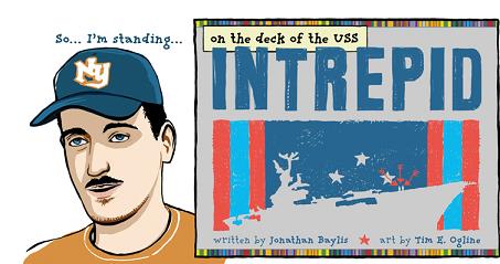
Intrepid is only eight pages long, the first four pages providing the context for the heart of it, a two page flashback, followed by another two pages of wrapup. In it Jonathan Bayliss tells of how he went and visited the museum ship USS Intrepid with his uncle, who served on it during the Vietnam war, and how this visit triggered his uncle to talk about the day he lost his best friend there. It’s told as if Jonathan is sitting across from you in the pub telling it to you, as emphasised by the very first panel, just a head and shoulders shot of him, against an empty background, next to the credits. This headshot returns several times, each time with a simple coloured background, as a sort of guide.

The panel placement is interesting. On most pages they’re laid out in three rows, in a mixture of full length “establishing shots” and rows of two square or rectangular half length panels. But when the story comes to the moment of crisis the horizontal rows are replaced with narrow, angular panels, laid out in two rows of three columns, while the “camera” steadily moves inwards, closing up on the uncle’s face as he remembers. Since this takes place while the narrator and his uncle go down a stairwell into the bowels of the ship, the panel layout emphasises the claustrophobic, cramped feel of this. The layout is mirrored on the seventh page, after the flashback, when the “camera” moves outward again as they move back up.

When we enter his flashback we are back to the normal layout, but on the sixth page, the death of his friend is shown in four full length horizontal panels. Both choices slow down time, reinforced by the almost static images in the panel, but in the second sequence you also get an impression of the speed with which the accident happened.


an example of how the artists shows flashbacks

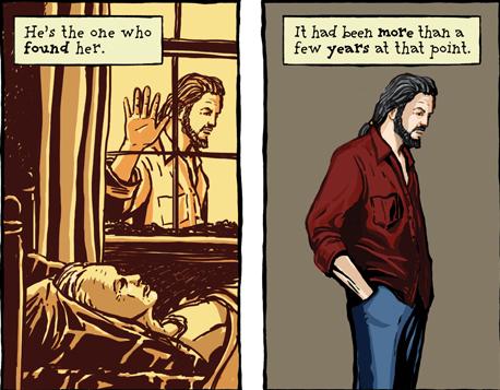
As the above image shows, Ogline represents flashbacks by way of a yellow-sepia background, then carries the feeling of the flashback over into the present by the character’s stance, repeated again on the following page, as well as, more symbolically and in silhouette after the main flashback sequence. This use of colour makes the flashbacks immediately identifyable and make it easier to understand them. Colour also plays a role in emphasising mood, getting darker leading up to the flashback, while the resolution is presented in bright, clean colours.

Ogline’s drawing style in general is somewhat streamlined, if you can call it that. His people have faces that show personality enough for you to realise that they’re modeled on real persons, but which are far less detailed than his backgrounds. Interestingly, in the flashback, there is much less detail shown, the planes more sketched than drawn, which again helps establish that these are memories.

To recap then, what makes this comic accesible to new readers are several techniques. First, the panel and page layout is kept deliberately simple, moving from top to bottom, right to left in predictable patterns, but with the panel shapes changed to emphasise mood. Second, there’s the use of colour to create a distinctive look for the flashbacks, as well as to once again emphasise mood and place. Third, there are the repetitive elements: the narrator’s headshot, the way the uncle stands, to guide the reader through the story. Finally, there’s the artist’s drawing style which keeps a fine balance between overwhelming realism and cartoon. These are all techniques used by all cartoonists at one time or another, on particular fine display here.