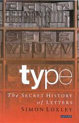
Type: The Secret History of Letters
Simon Loxley
248 pages, including index
published in 2004
Typography is one of those ultra-nerdy obsessions that sweep through geekdom every few years or so, with people getting het up about Comics Sans again. It can all seem incredibly tedious, but in the right hand typography and its history can become interesting. Fortunately, Simon Loxley is up to the challenge. Type: the Secret History of Letters treats the history of typesetting and fonts by showing the highlights, each chapter looking at a different development, without necessarily providing an exhaustive history. This keeps things interesting for people like me, vaguely but not hugely interested in the subject.
What got me to read the book was the first page, which had a concise explanation of the basic terminology of type, with examples. Which means that anytime you got confused when the text was talking about x-height and ascenders or descenders or the difference in serifed and sans serif typefaces, you could easily flip back and refresh your memory. In the same way I like how Loxley provides examples of the fonts he talks about, in the right or left side margins of the page they’re introduced, by showing the most distinctive letters of the font.
Loxley starts his history at the source, Gutenberg. You can’t have print fonts without printing after all. In passing he discusses all the other candidates for the invention of printing, including Holland’s own Laurenszoon Coster. He also uses this introductory chapter to explain the basic technology of the printing press and what typesetting exactly is. From there he moves on to the wonderful world of fonts, of how so many different looking fonts have been designed over the years and what the point of them is.
The original Gutenberg fonts were not so much designed as evolved, as Loxley tells it, from the example of handwritten manuscript. As printing took off and spread across Europe, new fonts were designed to fit local fashions and needs, as shown by the examples of William Caslon and John Baskerville. These fashions slowly changed over the next few centuries until the explosion of type in the nineteenth and twentieth centuries, with mass literacy and the rise of the advertisement industry. Loxley tells this story by hitting the hightlight, focusing on the main designers of an era like e.g Frederic Goudy or Eric Gill. Inbetween he has some detours to subjects only of secondary interest to the main topic, like the rise of micro foundries.
All this makes for a somewhat disjoined narrative, though to be honest if Loxley had attempted a more exhaustive history it would become boring anyway. That’s always the problem with writing a general introductory history on such a complicated subject, finding the right balance between depth and interest. Loxley for the most part managed to get this right, even if he sometimes lost himself in the details.