The Battle of Kursk – David M. Glantz & Jonathan M. House

The Battle of Kursk


The Battle of Kursk
David M. Glantz & Jonathan M. House
472 pages including index and notes
published in 1999

Kursk is a name most people probably only know from that Russian submarine that sank some years ago. Much fewer people know what that submarine was named after: one of the bloodiest and most important battles of World War II. The Battle of Kursk was fought in 1943, the largest tank battle of the war and was the last battle in which the Germans had the strategic initiative. After Kursk it was the Russians who held the upper hand and the Germans who had to defend. What’s more it was the first battle in which the Russian forces managed to stop the German blitzkrieg
It’s also a battle loved by war nerds, as it got the German panzer army at its peak taking on endless waves of Russian T-34s and Su-76s on the endless steppes and is so much more interesting than the infantry slog of Stalingrad…

However much of what we used to know about Kursk has come from German sources, as Soviet archives have only come available since the end of the USSR. So it has always been about the heroic deeds of the panzer commanders against the endless Slavic hordes so to speak. The emphasis has largely been on the Germans plans for the battle, on what went wrong for them and especially in the memoirs of those particpated, how it was not their fault that the battle was lost but Hitler’s. The Battle of Kursk is one of the first books on the battle to make full use of Soviet archives as well as German ones, giving a much more complete picture of the battle.
Read More

Why Buildings Fall Down – Matthys Levy and Mario Salvadori

Why Buildings Fall Down


Why Buildings Fall Down
Matthys Levy and Mario Salvadori
334 pages including index
published in 1992

It’s been a real pleasure to read this book. I read a lot of non-fiction, as you may have seen here over the years, but it’s rare that I come across a book that explains a difficult subject as lucidly and understandable as this one. Why Buildings Fall Down, as is obvious from the title, attempts to explain the science behind catastrophical structural collapses by examining various famous and not so famous disasters and tries to find common causes for them. The principle author, Mario Salvadori was a structural engineer with decades of experience in building things that don’t fall down and he and Matthys Levy are very good in translating this experience for the interested layperson like myself.

A great deal of the credit for the clarity of this book however lies also with the illustrator, Kevin Woest. Wherever the technical descriptions in the text get a bit too complicated for me, there was a drawing illustrating it perfectly. Such drawings have an advantage over using photographs, as with photos there’s always too much unimportant detail and often a muddiness in black and white. Woest’s drawings strip away everything that’s not necessary to illustrate a given concept, his art functioning as a plate of clear glass between the reader and the concept. It takes real skill to do this and do this properly.

Read More

Big Planet – Jack Vance

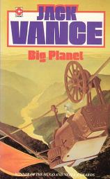
Cover of Big Planet


Big Planet
Jack Vance
158 pages
published in 1951

It’s always dangerous to reread books you fondly remember from your youth. As Jo Walton put it, between the time you last read it and your rereading it, a book might have been visited by the suck fairy, which has taken all the awesome bits you remember and replaced them with dullness. Worse, the racism or sexism fairy may have also visited… I was therefore taken a risk in rereading Big Planet, one of the earliest Jack Vance novels I had ever read. Would it still be the great planetary romance I remember, or would all the adventure and wonder have been sucked out of it?

It turned out to be a bit of both. Not as good or great an adventure as my memory had made it, but still worth reading on its own accord. What my memory had made of Big Planet was much more exotic and detailed than it turned out to be, the real thing much more sketched out than filled in and how could it not with only 158 pages to play with. Nevertheless Big Planet is an important novel in Jack Vance’s development as a writer, as well as influential on other writers, as it shaped the planetary romance subgenre. Planetary romance being any science fiction story which takes place on a single planet and where most of the book revolves around the exploration of the planet, the stage more important than the actors on it.

Read More

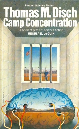
Camp Concentration – Thomas M. Disch

Cover of Camp Concentration


Camp Concentration
Thomas M. Disch
325 pages
published in 1968

Camp Concentration is a classic New Wave science fiction novel, but one I’ve never read before. I’ve always been a bit scared of Disch, due to his reputation as a “difficult” and pessimistic writer. These are qualities I’ve only recently started to appreciate, together with a renewed interest in New Wave science fiction. The New Wave was a time when science fiction went through a real literary revolution, as a new generation of writers started to question the genre’s core assumptions, first in the UK and then in America, where the New Wave went into a more political direction. Camp Concentration embodies this revolution perfectly.

It’s central idea, of political prisoners injected with a specially altered syphilis virus to make them hyperintelligent in order that they can design new superweapons for the American military, completely subverts science fiction’s traditional belief in technological progress. What’s more, any kind of dark thrill that could be had from this scenario is quickly undermined as well, as we never see the any sign of anything like that going on at all. Instead we get alchemy.

Read More

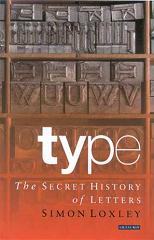
Type: The Secret History of Letters – Simon Loxley

Cover of Type: The Secret History of Letters


Type: The Secret History of Letters
Simon Loxley
248 pages, including index
published in 2004

Typography is one of those ultra-nerdy obsessions that sweep through geekdom every few years or so, with people getting het up about Comics Sans again. It can all seem incredibly tedious, but in the right hand typography and its history can become interesting. Fortunately, Simon Loxley is up to the challenge. Type: the Secret History of Letters treats the history of typesetting and fonts by showing the highlights, each chapter looking at a different development, without necessarily providing an exhaustive history. This keeps things interesting for people like me, vaguely but not hugely interested in the subject.

What got me to read the book was the first page, which had a concise explanation of the basic terminology of type, with examples. Which means that anytime you got confused when the text was talking about x-height and ascenders or descenders or the difference in serifed and sans serif typefaces, you could easily flip back and refresh your memory. In the same way I like how Loxley provides examples of the fonts he talks about, in the right or left side margins of the page they’re introduced, by showing the most distinctive letters of the font.

Loxley starts his history at the source, Gutenberg. You can’t have print fonts without printing after all. In passing he discusses all the other candidates for the invention of printing, including Holland’s own Laurenszoon Coster. He also uses this introductory chapter to explain the basic technology of the printing press and what typesetting exactly is. From there he moves on to the wonderful world of fonts, of how so many different looking fonts have been designed over the years and what the point of them is.

The original Gutenberg fonts were not so much designed as evolved, as Loxley tells it, from the example of handwritten manuscript. As printing took off and spread across Europe, new fonts were designed to fit local fashions and needs, as shown by the examples of William Caslon and John Baskerville. These fashions slowly changed over the next few centuries until the explosion of type in the nineteenth and twentieth centuries, with mass literacy and the rise of the advertisement industry. Loxley tells this story by hitting the hightlight, focusing on the main designers of an era like e.g Frederic Goudy or Eric Gill. Inbetween he has some detours to subjects only of secondary interest to the main topic, like the rise of micro foundries.

All this makes for a somewhat disjoined narrative, though to be honest if Loxley had attempted a more exhaustive history it would become boring anyway. That’s always the problem with writing a general introductory history on such a complicated subject, finding the right balance between depth and interest. Loxley for the most part managed to get this right, even if he sometimes lost himself in the details.