Joost Swarte starts new comics publisher


Sadly so far both the video and the website are only available in Dutch, but new comics publisher Scratch Books is an initiative of comics legend Joost Swarte, ex-Oog&Blik publisher Hansje Joustra and ex-comicshop owner turned businessman Wiebe Mokken. According to the press release they aim to release some twenty titles a year, both from Dutch and foreign cartoonists. Amongst the names mentioned who will publish new comics through Scratch Books are Guido van Driel, Robert Crumb, Graig Thompson, Erik Kriek, Ever Meulen, Joost Swarte, Typex and Henning Wagenbreth. Whether in the case of e.g. Crumb this means a new Dutch translation of existing work or a new book entirely isn’t mentioned. What is mentioned is that the publisher is also going to attempt to market their Dutch cartoonists abroad.

In any case, having a new, less commercially orientated publisher in the Netherlands is urgently needed. If Scratch Book can live up to the expectations of having onboard both Joost Swarte, one of the best Dutch cartoonists ever as well as an equally great graphic designer, as well as Hansje Joustra, who with Oog&Blik managed to build an international reputation as a quality publisher, than it could well become a very important publisher. There are so many great cartoonists here struggling to find an audience, any new outlet is welcome.

Tintin versus the big noses

Rudi de Vries’ dissertation Comics and co-evolutions : a study of the dynamics in the niche of comics publishers in the Low Countries, attempting to explain why the Dutch comics industry lags behind that of France and Belgium, sounds interesting:

Hergé’s exciting but wholesome adventures of Tintin were originally published in a refined Catholic magazine, and soon found their way to France and the Netherlands. The ‘big nose’ style favoured by Dupuis, publisher of the Robbedoes comic strips, became very popular, inspiring Goscinny and Uderzo, the creators of Asterix. De Vries: ‘The fierce rivalry that developed between the Belgian publishers only served to stimulate production.’ Cartoonists like Hergé (Tintin), Morris (Lucky Luke), Peyo (Smurfs) and Franquin (Guust Flater or Gaston) grasped this opportunity to exercise their influence on the development of comic culture.

[…]

The Dutch comic culture is lagging behind the rest of the world. The swift rise of comics in Belgium and France can be traced back to historical developments. Back then, Dutch publishers were happy with translations of foreign comic strips. De Vries: ‘There are other reasons for Dutch comics failing to thrive, but they are more difficult to pinpoint. I think it has something to do with our Calvinistic outlook on life.’

The complete dissertation can be downloaded from the University of Groningen website. Found via Dutch comics journalist/blogger Michael Minneboo through the interview (Dutch only) he did with de Vries last year.

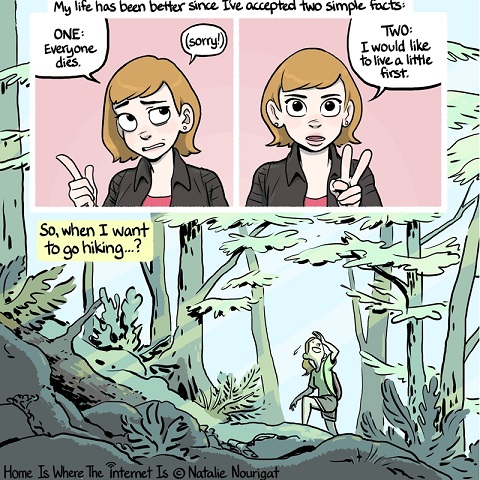
“Everybody dies someday – At least I saw Provence first”

extract from Don't let fear stop you from traveling

There’s nothing I don’t like about Natalie Nourigat’s Don’t let fear stop you from traveling. The story, the message, done without preaching, the cute characters, the artwork. What I especially found impressive is how well it looks even on the small screen of my mobile phone, still easily readable (and loaded relatively quickly as well).

It’s interesting how text heavy this strip is. Nourigat makes full uses of captions, thought balloons and all the other comics paraphernalia the modern superhero strip has rejected as not serious enough. Yet here Nourigat tells the story mainly through captions, only occasionally talking directly through the reader, transitioning seamlessly between the two, as above. It’s a technique you see a lot in diary and non-fiction comics (Joe Sacco’s work e.g.). Done wrong, it can be stilted, unnatural and dull, but Nourigat makes it work, knowing when to use normal dialogue instead. You don’t normally notice lettering in comics, but there are a lot of regular comics that could use Nourigat’s lettering here as an example of how to do it well.

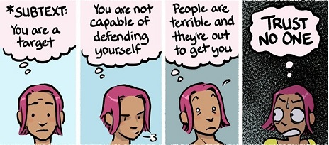
use of colour by Nourigat

Nourigat’s artwork is clean with crisp, clear lines and an excellent use of colour, especially background colour. Whenever she’s able, Nourigat drops any background details from her panels, using single slabs of colour instead. this of course helps to make them more easily readable in a smaller format, making the foreground characters “pop” out even on a mobile phone. It also helps to distinguish “story” panels from “commentary” panels; everytime she herselfs appears to talk directly to the reader, it’s against a solid single colour background. She also uses these colours to indicate moods, as above, where the colour slowly changes from light to dark.

What I only really noticed once I started going over this story again for this post is the way she simplifies her drawings where needed. Her characters have, big, expressive eyes in the larger, closeup panels and just dots in smaller and action orientated scenes. Mouths become simple lines or ovals,figures are reduced to a few lines. Sometimes she does it even in the same panel, with the viewpoint character having normal eyes etc and background figures sketched in. Again, it makes it easier to read on smaller screens and makes the story less busy in general, helping to guide the reader to what’s important, rather than overwhelming them with unnecessary detail.

In short, this is an incredible showcase for how to draw comics for the modern internet and it’s impressive enough I bought a couple of her books online.

No Riesman, making Captain America a dick isn’t interesting

Abraham Riesman gets Captain America all wrong, because he’s ignorant:

cover of Captain America Comics #1, with Cap punches Hitler

Let’s think about that core story for a minute. Imagine someone frozen in the 1940s being dropped into the 2010s with no experience of the intervening decades. Someone still high on ’40s social norms, righteous wartime adrenaline, and super-serum. Would he be the gentle, sensitive man we see in Marvel’s films and comics? It’s certainly possible. But isn’t it more likely — and more interesting to imagine — that we would find him difficult and reactionary? That he’d be uncomfortably macho and out of touch with modern values? In other words: Wouldn’t he be more John McCain than Barack Obama?

No.

Because Captain America isn’t just “someone frozen in the 1940s”, he’s a premature anti-fascist who grew in the Brooklyn of the 1930s, in Roosevelt’s New Deal America, who cared enough about the growning menace of fascism to volunteer for a dangerous, dodgy experiment after every draft board in New York had rejected him. He punched out Hitler in his very first cover for heaven’s sake, a year before the US would declare war on Germany. He let himself be made into an ubermensch just to fight those who actually think in terms of unter and ubermenschen. That was there from Captain America Comics #1, put in there by his Jewish-American creators Joe Simon and Jack Kirby.

And when Lee and Kirby brought him back in the sixties, it was clear from the start that no matter how much trouble he had adjusting to the modern world, intolerance and machismo wasn’t part of it; the first actual African-American superhero (the same as in the new movie) debuted in Captain America. What Cap struggled with instead was with having his friends and family aged or gone, having to adjust to a world that went through several decades of change without him.

Riesman’s idea of a man out of time being an ignorant, reactionary dick is about the most dull and obvious you can have and it’s no wonder he takes his lead from the execrable Ultimates series.

Norman Rockwell: The Problem We All Live With

I like Lawyers, Guns and Money commenter Sly’s view of Captain America much better:

The best way to understand Captain America is that he is “weaponized Norman Rockwell.” And not just the Norman Rockwell who painted Boy Scouts, Santa Claus, and baseball games, but the Norman Rockwell who painted Roosevelt’s Four Freedoms, Rosie the Riveter, and little black girls being escorted to desegregated schools by Federal marshals.

Both Rockwell and Cap were actually much more lefty than their sanitised images — pushed by the sort of conservatives who imagine the American flag is theirs and theirs alone — allow for. Rockwell’s art, before, during and after World War II had a political, liberal left content that’s been ignored since. That iconic image of the townhall meeting from the Four Freedoms series of paintings has so often been appropriated as a nostalgic vision of America’s small town roots, stripped from the context that made it radical.

The same of course goes for Captain America, who can look so easily like just another jingoistic symbol of America, for those who can’t look past his star spangled uniform. But Cap only works when his writers acknowledge the fundamental decenty and honesty of the character, his genuine Roosevelt Democrat beliefs.