South Park conservatives? Try Merry Marvel conservatives

Venerable Comics blog ComicsComics has proof that the annoying tendency of modern conservatives to see evidence of conservative values in any halfway popular media phenomenom. But whereas today it’s television series like South Park, Lost or even The Wire they like to claim for the rightwing, back in 1966 it was Marvel comics:

But despite their lightheartedness, the heroes are indeed heroic, and the villains villainous. This in itself is not amazing—but the fact that the heroes run to being such capitalistic types as arms manufacturers (Tony Stark, whose alter ego is Iron Man), while the villains are often Communists (and plainly labeled as such, in less than complimentary terms) is a breath of fresh air in a world such as ours, where all too often “good guys” and “bad guys” are portrayed as being indistinguishable.

And it is in their frank recognition of the difference between good and evil that makes Marvel Comics, at least in my opinion, “right wing” in tone. The “Bullpen Gang,” as the Marvel staffers refer to themselves in print, is not afraid to say that good and evil are mutually incompatible. Furthermore, they equate good with freedom and evil with totalitarianism, whether Communist, Nazi, or inhuman in origin. This is the “message” so assiduously repeated in all their sagas—and with such a message, no YAF member should have any quarrel.

Roy of the Pilgrims?!

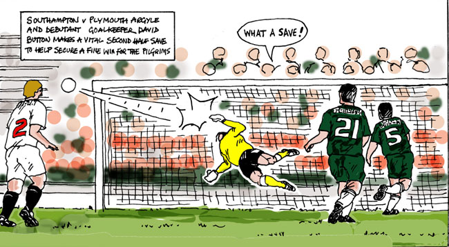
Last week Plymouth Argyle played its first match in League One after having been relegated last year and actually won the game, but there was something else strange about the game as well: no press photographers allowed at Southampton. So The Plymouth Herald got amateur cartoonist (and city historian) Chris Robinson to do the reporting instead. One of the results you see above — not bad at all, with a nice old skool Roy of the Rovers feel to it. Not quite an coincidence that, as Robinson says he let himself indeed be inspired by that strip. And it’s not only a nice piece of nostalgia and a clever solution to a stupid club rule, but also a great refutation of Scott McCloud’s idea that you can’t have sequential art in a sequence of one…

Gr’unn!

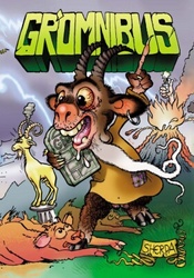
cover of Gromnibus

A can’t miss bargain to be had at De Slegte in Amsterdam right now: copies of Gr’omnibus, a treasure trove of sequential art from Groningen, the Athens of the North; an invaluable treasure now yours for only two euro fifty! Why you should bother? Because you get to sample some 40 odd (some very odd) Dutch (as well as the occasional furreign) cartoon talents, culled from the pages of one of the most consistent of Dutch underground comix zines, G’runn.

Most foreigners might be forgiven for believing there’s not much more to the Netherlands than Amsterdam, Den Haag and perhaps some pittoresque village like (ugh) Volendam, with Zeeland thrown in for free for our German friends who tend to encamp on the beaches there each summer in a more benign re-enactment of the Maydays of 1940, but there are other interesting cities in the rest of the Netherlands as well, even up North. Groningen (Gr’unn in the local dialect) is one of them, a university town big enough not to be overwhelmed by it with a decent local art scene and nightlife, a city in which over the years a thriving alt-comix scene has been established.

In 1996 a few of them started Gr’unn, which since then has published a lot of up and coming cartoonists. People like Barbara Stok, Mark Hendriks, Amoebe, the Lamelos collective, Marcel Ruijters, Reinder Dijkhuis, Berend Vonk, all had strips in Gr’unn. And as such it helped establish, together with Zone 5300 and more amateur zines like Impuls or Iris, the first generation of cartoonists neither interested in going the traditional comics route of magazines or newspapers, nor in consciously rebelling against this, but who just went their own way.

Any anthology of a comix zine celebrating its ten years anniversary will always be uneven and of course Gr’omnibus is this as well. Some of the cartoonists are better or more interesting than others, while there’s a huge mix of styles and subjects represented as well. But there is common ground as well. Autobiographical or fantasy, stick figures or obsessive crosshatching, what most of the stories and artists present have in common is a prediliction for the light ironic and the cynical, short gag stories but with a twist of bitterness and not too much emotional investment. It’s a style of writing I quite like, though it can be a bit wearing in large doses. No real masterpieces here, but still more gems than dross and no real bad stories either.

So if you’re in Amsterdam and you want a cheap way to sample a huge chunk of the contemporary Dutch comix scene, go get Gr’omnibus from de Slegte. It’s in the middle of Kalverstraat so even tourists should be able to find it.

Secret Warriors: seriously shitty

I don’t know who recommed Secret Warriors to me as an actually readable Marvel comic, but whoever did wants shooting. Just spend an hour reading through the first seventeen issues, all that’s been published so far and it got everything I hate in modern superhero comics. It’s all climax and no buildup, where every issue has to be important, every page a revelation, every panel a beat. At the same time, so much of the importance of what we’re seeing on the pages is not in the issues themselves, but derived from other titles and crossovers, especially in the first six issues, fitting in with that whole Dark Reign event. The art doesn’t help, because while the artist Stefano Caselli is not bad, more times than not you have to guess at who that shocking character at the end of yet another Big Reveal was actually meant to be. The usual “realistic” muddy computer colouring doesn’t help either.

I don’t really want to talk about the overall plot of the series and how develops, because that’s not really the issue here. What I found annoying is the storytelling rather than the story. So let me try to make it clear what I object to, by looking in detail at Secret Warriors #1. The first thing is that this is a properly modern superhero comic: no thought balloons, almost no sound effects (three blam, blam, blams in) , no speed or action lines and captions used like in the movies: establishing a place and time for a new scene, as well as to represent the first person narration by one of the characters, which comes and goes according to whether or not she is in a scene. Of these three I miss the sound effects and speedlines the most, as without them the action seems stilted.

Moving on, this issue has two covers, the normal one and a variant cover showing three characters not appearing int he comic and whose significance I only found out by looking at Wikipedia. Which is the second problem with this series, in that it comes out of an earlier crossover event, with the backstory to these characters told there, but never refered to here. This is annoying in the extreme. I’m sure that if you’re a Marvel zombie you know who all those people are, but I didn’t, I just want to be able to read a comic without having to read a zillion more just to keep up with who the players are.

Now we come to the major problem with the issue and the series. The issues starts with two people talking at what looks like some oil refinery in Texas, shots sound and they and several other people start whaling on Hydra agents, after which another set of armoured villains drop down out of the sky and starts attacking everybody. The first set of people, who as it turns out are Fury’s rookie superhero agents, flee the scene back to their secret base to be reamed out by Fury himself for exposing themselves needlessly. We stick with our narrator as she and Fury look in at a twelve year old boy playing computer games, who’s apparantly a god. Then she asks Nick what’s bothering him and we get a flashback sequence of him breaking into an ex-SHIELD computer centre, as well as a chat with the US president, which ends with Fury showing exactly what he found. Cue various database files ending the issue.

This is actually one of the better issues in the series for actually connecting the various scenes into a coherent whole, but it still reads like a series of independent scenes, not a story. We start in the middle of a story and end there, but there’s no sense of a journey, just one thing happening and then another. The series as a whole sofar reads as if somebody took all the kewl scenes from some summer blockbuster and didn’t bother filling in the rest of the movie.

Then we come to the art. The splashpage below is from the first issue and can serve as an example.

Splashpage from Secret Warriors 01

Can you tell easily what’s going on here? How you should read it? Follow the caption boxes, which have nothing much to do with the action on the page? Or read it from bottom left to top right or vice versa? The composition makes no sense, there are no natural lines for your eye to follow the action and the result is a mess. It doesn’t even look that cool. Most of the rest of the issue has the obligatory widescreen, narrow panels of modern superhero comics, mixed with inset vertical panels closing up on a face or an action. Again, no sense that much thought has gone in laying out the pages to help the story.

So, not impressed with Secret Warriors. If I can sum it up, it feels as if a whole layer of storytelling has gone missing in a misguided attempt to make a comic look more like a movie.
DC Comics still clueless

Proof that DC Comics still does not get Alan Moore, even twentyfive years after Watchmen:

However, DC Comics co-publishers Dan DiDio and Jim Lee said, “Watchmen is the most celebrated graphic novel of all time. Rest assured, DC Comics would only revisit these iconic characters if the creative vision of any proposed new stories matched the quality set by Alan Moore and Dave Gibbons nearly 25 years ago, and our first discussion on any of this would naturally be with the creators themselves.”

It also shows the essential inability of DC to sell comics any other way but by constant regurgitation of characters, concepts and series, on the monthly superhero pamphlet model. That Alan Moore would want to stay far away from this, that his approval cannot be bought even with the rights to the original series, is both unsurprising and understandable. Watchmen needs no sequls, prequels or side projects: everything Moore and Gibbons had to say about it was said in the original series, which was a product of the time and place it was produced and anything else that will be done in its name will only lessen the original.

Can you imagine a Jim Lee or Dan Didio greenlighted Watchmen project, written perhaps by Darwyn Cooke or a Garth Ennis or Mark Millar (and I don’t honestly know what would be worse: Cooke’s fauxstalgia let loose on Watchmen or the inevitablity of Ennis or Millar going for a Rorschach prison rape “joke”), drawn by whoever is the to-go guy for dark, moody serious superheroics. It would be awful, but still sell on the scale of what DC did to Milestone, with what was a great attempt to create modern superheroes for a properly multiracial America has been folded into the DC mainstream to function as spear carriers and capeholders for old, white supermen.

DC will use up the Watchmen characters because that’s the only thing DC knows how to do, though often they don’t even know how to make effective use of them. As Tim O’Neill points out, this is the main failing of both Marvel and DC, because that’s what their business models are build on. With their comics mean selling points now being their ability to be turned into succesful summer blockbusters (and the continuing sale of pamphlets and deluxe hardcovers to aging fanboys a nice sideline) this has only gotten worse. DC doesn’t just want Watchmen 2: the comic, it wants Watchmen: the Saturday morning cartoon.