Connie Willis: bland, bad, popular

Andrew Hickey is not subtle in his criticism of Connie Willis and her latest novels Blackout/All Clear, concluding:

This is someone who has apparently had a successful writing career for as long as I’ve been alive. On the evidence of this utter, appalling, piece of shit, this travesty, this disgrace that makes Dan Brown look like a more elegant and refined version of F. Scott Fitzgerald, I can only assume that she has incriminating photos of the head of publishing at Spectra, her publishers, and of the people who choose the Hugo shortlists. In which case, I can only say to let her release the photos – they could hardly do more damage to your reputations than these books do.

I haven’t read these novels, but all the flaws Andrew mentions were also present in her older novels like e.g. To Say Nothing about the Dog. She has a fondness for screwball comedy plotting, where all the problems her protagonists have to deal with are largely caused by them not talking to each other, prefering to run around like headless chickens. She’s not very good at creating believable villains either, for whom cardboard would be a compliment as she just cannot imagine anybody wanting to oppose her characters. Don’t read her novels for their plot. What’s more, despite her genuine Anglophilia, she’s sloppy in her research, her vision of England barely a step above say the Phantom Rasberry Blower of Old London Town, to say nothing of the atrocities she allows her characters to perpetuate on the Queen’s English.

Idiot plotting, bad research, padding and yet Willis is incredibly popular and a perennial Hugo candidate and winner. She must be doing something right and indeed her saving grace is her gift at storytelling. She’s a good read, not too demanding, easily digestable and flatters the reader outrageously by hitting them over the head with her “subtle” allusions — she makes sure you know To Say Nothing about the Dog is a homage to Jerome K. Jerome’s Three Men in a Boat and praises you for getting it.

Connie Willis, like a whole slew of other bland but persistently popular sf writers (Robert J. Sawyer, Allan Steele, Mike Resnick to name three), is popular because she never underestimates her audience. She knows the trick of spoon feeding her readers without being blatant about it, ladling out easily digestable story and complimenting her readers’ ability to swallow. Judging from everything I’ve heard about Blackout/All Clear however, she has now lost that knack and all that remains are the flaws. If she wins the Hugo for it, it would be the final nail in its coffin.

The Amsterdam of Theo van den Boogaard: must see

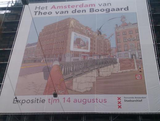
poster for the Theo van den Boogaard exhibition in the Stadsarchief

So today I went to the Theo van den Boogaard exhibition in the Amsterdam city Archives, which was small but brilliant. Theo van den Boogaard is one of Holland’s best cartoonists, having started his career in the sixties, working for various counterculture (so to speak) magazines creating a series of ground and taboo breaking comics. His greatest succes however was with Sjef van Oekel, an incredibly anarchic, chaotic comic strip drawn in what is perhaps the most disciplined art style possible, the Ligne Claire or clear line. Sjef van Oekel, who started out as a character in a Dutch satirical television show, is a middle aged and self absorbed, doesn’t quite think like normal people and his actions usually cause chaos and destruction all around him. What makes it work is the clear, precise ligne claire style Theo van den Boogaard draws his adventures in, set against the background of the immediately recognisable city of Amsterdam. His drawings are chock ful of detail, yet you get them immediately. His drawing style also did well on various advertising posters and artwork he did for companies like the Dutch railways and other public transport providers, as well as the city of Amsterdam.

All of which was on show in the exhibition, which put the focus on the city of Amsterdam as van den Boogaard portrays it. So you had the various adverts showcasing new railway stations and such, but also large extracts of the Sjef van Oekel strips showing how he had used Amsterdam in those. Alongside those there were also other pieces of artwork that don’t feature Amsterdam as much but provide some context for his career. It’s not just the finished artwork on display either: for some of the key drawings the working sketches and various stages and research material is shown as well. It’s great to see all this art shown actual size and up close, seeing all the details less noticable when published in a smaller format.

Theo van Boogaard at work

What struck me about it is not just the meticulous way in which van den Boogaard works, but also how he’s not afraid to warp the city when he needs to. He’s not stuck to his research or the need to keep the city real, but sticks bits and pieces together when he needs to, in the same way Hollywood sometimes uses bits of Vancouver to be New York say, but much more believable. Van den Boogaard has that ability to make you see the city through his eyes, so that when you walk out of the exhibition you see Amsterdam all clear lines and looking exactly as if van den Boogaard had drawn it.

Against this realistic background van den Boogaard puts his larger than life characters, constantly in movement, always slightly exaggerated even when standing still. This is of course a general characteristic of clear line strips, but unlike some van den Boogaard’s characters always look as if they fit the decor. His characters look as if they could walk off the page immediately and not look out of place in the real Amsterdam..

The exhibition is small and can be gotten through in an hour, but its focus on Amsterdam, on how van den Boogart shows the city and uses the city, manipulates and mutates the city for his own needs makes this exhibition work. If you are in Amsterdam sometime before the 14th August, are interested in comics and have had enough of all the highbrow musea, admission is only five euros and it’ll give you much to think about it. Be sure to also pick up the book of the exhibition.

ABC book sale loot

Pile of books I bought in the ABC sale

Above is the pile of books I bought in the ABC book sale: five euros per kilo of books, bring large bags. All of this cost me twentyfive euros, which is not bad for thirteen books. From top to bottom:

  • The Edge of Reason — Melinda Snodgrass. This looked okayish and it’s a writer I haven’t read anything from so I took a punt
  • Wyrdest Link — Pratchett and Langford: Discworld quiz book
  • Africa –John Reader. One volume history of the continent
  • The Extremes — Christopher Priest
  • The Cretan Runner — George Psychoundakis. A classic schlachtbummeler book, about the occupation of Crete in WWII
  • The Vengeance of Rome — Michael Moorcock. Last of the Colonel Pryat Quartet
  • Mythago Wood — Robert Holdstock. Read this in the library decades ago, this is the twentyfifth anniversay edition
  • A Distant Mirror — Barbara Tuchman. Replacement copy as mine had split in half
  • Beat Master’s Planet — Andre Norton. Collection of two classic novels, best known for inspiring the not that bad Marc Singer movie
  • Tiptree Award Anthology Vol. 2
  • Whoops — John Lanchester: I recognised his name from his articles about the economic crisis in the LBR; this is the book treatment of same
  • The Half-Made World — Felix Gilman. A much discussed book in sf&f circles
  • Penny Arcade vol. 2 More reprints of the webcomic

This was on my mind today

In the midst of his vacation, Timothy Burke had to take an unforseen trip to the emergency room. Not a nice experience at the best of times, but this was in America and things are done differently there than in civilised countries:

After waiting two and a half hours, I began to get the picture. The nurse on duty repeatedly called patients who were not present, who had checked in and then left later on. At first I thought it odd that they kept calling and calling for almost thirty minutes for people who were very obviously not there while not calling cases of people who were present. Every once in a while, someone who was there was called and seen, though in a few of those cases, the nurse on duty simply took vitals again and sent them back to the waiting room. At the limits of my endurance, I finally went up to ask how long I might expect to wait. “We’re still seeing cases that checked in between one or two p.m. today,” I was told. Meaning it might be four in the morning before I was seen, I asked, stunned? Yes, that’s very possible, said the nurse. I gave up at that point: infection, disease, whatever it was, if I was going to continue to worsen overnight, I’d damn well go back and do it in my hotel room and hope for better in San Francisco. (Which I found, thanks in part to my Facebook friends.)

And why it’s on my mind is because I read about while I was waiting around an emergency room myself, as once again poor old S. had to be taken back into hospital. In our case though she was seen and helped within minutes and was it just the medicial process itself of getting her stabilised, getting an I.V. hooked up, blood tests, x-rays unsoweiter that took a long time. Bureaucratic nonsense? Much less. So whenever I’m starting to wallow in self puity I remember things could be much worse and we could’ve had all this shit in America and we’d been bankrupt or dead by now.

This is what passes for a joke in Austria

Austrian man strikes a blow for atheism:

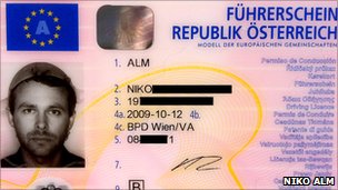
Austrian driving licence

An Austrian atheist has won the right to be shown on his driving-licence photo wearing a pasta strainer as “religious headgear”.

Niko Alm first applied for the licence three years ago after reading that headgear was allowed in official pictures only for confessional reasons.

Mr Alm said the sieve was a requirement of his religion, pastafarianism.

Hi-larious. This sort of thing is why I dislike the “new atheism”.