Love and Language Barriers — Okitsura — first Impressions

I feel sorry for the unfortunate subtitler on this series:

Half the screen is covered in subtitles but there's a blonde haired girl standing next to a black haired boy with a smaller, brown skinned girl next to him

Teruaki moved from Tokyo to Okinawa and has become besotted with his class mate Kyan, but there’s one problem. She speaks Uchinaaguchi, the indigenous language of Okinawa which almost entirely but not quite unlike standard Japanese. Luckily there’s his other classmate Hina who does understand her and translates for him. Which she doesn’t do out of the kindness of her heart but because she fancies him. Teruaki loves Kyan, Hina loves Teruaki and Kyan is just an adorable gremlin who seems to be rooting for her friend. An incomplete love triangle romcom that’s also about selling Okinawan culture to its audience.

But how do you represent one character speaking in basically another language on screen? Clearly thinking it was not enough to just have Kyan speak Uchinaaguchi, the Japanese production added subtitles for her as well. And at times these subtitles show both the original Uchinaaguchi as the Japanese translation, both of which the English translator also shows, the Uchinaaguchi done in romanji. Which means there are four different subtitles covering the screen. Not sure why the original subs couldn’t have been removed beforehand, but maybe they were hardsubbed into the master file? It makes watching this a lot more difficult than it could’ve been.

Apart from the subtitle issues this is a fairly unremarkable mix of romcom and tourist information; charming enough to continue watching though the gimmick started wearing thin already by the end of this first episode. The various explorations of Okinawan culture and behaviour also felt slightly patronising? Very much as made by outsiders to the island, enthusiastic and well intentioned perhaps, but not maybe that familiar with the culture to show more than the surface details of it. Having Teruaki, an outsider himself, as the main viewpoint character reinforces this. A series like this does probably need a character like this, as clueless as the audience presumably is about Okinawa, to have its culture explained to. Nevertheless currently the series treats Okinawan culture like a Slice of Moe show would treat a hobby like fly fishing and that grates.

You probably cannot expect a light and fluffy romcom like Okitsura to go into the colonial relationship between Japan and Okinawa, and the reasons why a young girl speaking Uchinaaguchi is extremely unlikely, but it does colour my perception of the show. Japan, not unlike the Netherlands, has a very rose tinted view of its own colonial past, to the point where it’s hard to recognise Okinawa (or Hokkaido for that matter) was once its own country. Even a ‘harmless’ comedy like this will be coloured by this. Personally, I can ignore this in favour of just enjoying the show, but I fully understand why somebody like Cy Catwell cannot:

It’s a shame that this is where I’m landing because I don’t think this is necessarily bad, but I think it’s uncomfortable. I think my lived experience in Japan and my lived experience as a second class citizen in my own home country have left me at odds with being able to igonre the potential for issues when it comes to colonizer student and colonized classmates. Maybe things will stay the course and the crush Teruaki has will fade into the background in lieu of more linguistics and exploration of his time in Okinawa. I have a sinking feeling it won’t, which is why I’ll be saying guburii sabira to my time with this show.

Leather & Lace 01 — #aComicaDay (65)

When you are that proud of the plot of your porn comic, everybody should read it, so you bring out a general audience version.

A blonde girl in torn negligee, her nipples prominently displayed is clining to a Japanese looking girl in a tight bodysuit, with equally protruding nipples, holding a sword (the girl, not the nipples)

Staying within the proud tradition of Malibu and its zillions confusing imprints and related comics companies, this is Aircel’s first issue of the “general audiences” version of Leather & Lace. The man responsible for it is Barry Blair, who wrote and drew roughly a zillion different series for Aircel and related companies, most on the same level as this one/ Leather & Lace would run for a whopping 25 issues, the first eight of which got a “general audiences” release with the porn excised. Presumably they stopped doing them because everybody who’d want to buy the series would rather get the porn version. Even this “clean” version is dodgy enough with its nippleage that you probably don’t want your kids to read it.

To start with the obvious: the porn scenes are not worth the additional $0.55 it would’ve cost to buy the adults only version. The blonde on the cover is assaulted and double teamed by twin twinks in lizard bodysuits for a bit of oral, the other girl is also attacked by a bloke who is very grateful when she’s starts beating him up and finally, the villain of the piece gets a blowjob in his office from one of his floozies. That’s it. The “clean” version mostly just skips these scenes, although that second one is replaced by a page of the ninja looking girl crawling through ventilation vents instead. Very heterosexual even if the cover does hint at a bit of sexual attraction between the two leads.

The plot is simple. Pamela, the blonde, is visiting a certain night club to find her sister, who disappeared from there some time ago. Chris meanwhile, together with her twink partner Billy, is just aiming to rob the place. The two meet just in time for Chris to save Pamela from being drugged and disappeared like her sister was and escape the club together. The story ends with the club’s owner and villain swearing that he will get “these two bimbos” while Pamela and Chris relax, both in their undies, at Chris’ hideout, thinking about how to bring him down. Very eighties B-movie territory.

I got this in the random back issue boxes of my local comic shop because it looked interesting, mostly for the reasons you think it would. Blair’s storytelling and artwork is decent enough that reading this isn’t a chore. Barry Blair was an interesting fellow, who sadly died in 2010. Aircel actually started out as his own company before Malibu acquired it. It had actually started as an insulation company (!) owned by a friend of his. Blair had already been self publishing Elflord and other comics before he started Aircel, for which he was so prolific at one point every title they published was written & drawn by him. Most of these had similar levels of sex and violence as Leather & Lace had. Very much pulp entertainment, with his best remembered work probably being Gun Fury, a Punisher parody that got some critical attention at the time. This issue however is the only work of his I ever saw myself.

Protectors 05 — #aComicaDay (64)

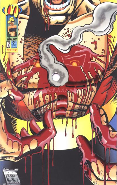
This book has a hole in it I-it’s not mint! Dear god in heaven it’s not mint! People, I give you the dumbest ever cover gimmick, courtesy of the good folk at Malibu.

A bloody bare chest takes up most of the cover, with two bloody hands held in front of it and the character's mouth wide open, only his bottom teeth visible. Int he center of the cover is a literal round hole

This stupid stunt only makes sense in the context of when it came out. By the early nineties, comics had been overrun by speculators, idiots who bought them as investments. These had already crashed the market once before in the 1987 black and white bust, when everybody looking to be the next Teenage Mutant Ninja Turtle launched their own much crappier version, speculators bought them until even they realised they were worthless and dozens of comic shops went bankrupt, left with thousands of unsellable comics. By 1992 though this was long forgotten as more and more people started treating comics this way, thanks in no small part to price guide magazines like Wizard judging comics only by how ‘hot’ they were.

And what makes a comic hot? Not so much a good story or great artwork, but whether it had the flavour of the month artist on it, or guest starred a particular character, or was important in some way other than in being an enjoyable read. Books like the Turtles had become hot through years of hard slog and word of mouth sales, but that’s difficult. Far easier to just slap a gimmicky cover on your comic instead. People loved that shit in the nineties. Gatefold covers, chromium covers, gold or silver foil covers, covers you can rub the blood on, anything that made a cover special in any way was like catnip to collectors. Most of those were harmless fun, but one or two, like DC’s Eclipso: the Darkness Within #01 had gimmicks that could do actual damage; in this particular case because it had a fake plastic gem glued to the cover which is not good for whichever comic is put in front of it. Protectors #05 went a step further: it actually damaged the book it was covering. The hole after all went through the entire issue.

If this sounds like a parody of what somebody wanting to spoof the special cover craze, that’s because it is. Malibu stole the gimmick from a small press title, Jab, whose third issue had its entire run shot through with various calibres of guns, to create several variant covers! That comic had been actually designed for it, but here Malibu had just punched a hole without any thought on how to incorporate it in the actual story and page composition. It’s very clearly something that was done afterwards, inspired by or stolen from that Jab issue.

I remember seeing the ad for the original Jab issue in Advance Comics, a few months before Protectors 05 came out. Even in there it was very much presented as a joke, so I was flabbergasted when Malibu did it for real. Just unbelievably crass and stupid all round.

The actual comic? Ehhhh. Protectors was a superhero series created out of old Golden Age characters from the long defunct Centaur Comics, written and created by R. A. Jones, with Thomas Derenick, who also did the cover as inked by Mike S. Miller. This issue featured the death of Nightmask, whose chest the hole was punched through on the cover. On the whole, one of those series that looked better in the Comics Scene interview I read about it then in the actual series. Even so, it really didn’t deserve this cover.

Is it the sport she likes or the player? — Sorairo Utility — First Impressions

This too is yuri:

Minami, a first year high school girl has a very relatable problem: the gacha game she put all her time and money in is ending service. Now what’s she gonna do? Her friend Izumi suggests it’s a good thing, now she can actually do something you can only do in high school, like join a school club or do a part time job or find a boyfriend. That youth stuff, eh? Not something she seems overtly interested in (especially the last item, considering her reaction to that female golfer later on in the episode). But when Izumi suggest it might unlock a hidden talent, she gets fired up and starts trying every club in school, failing miserably with all. Once she broadens her quest to outside of school, she runs into an old man with back problems, who asks her to bring his golf bag to the nearby driving range where she sees the golf girl from the video and the rest is history…

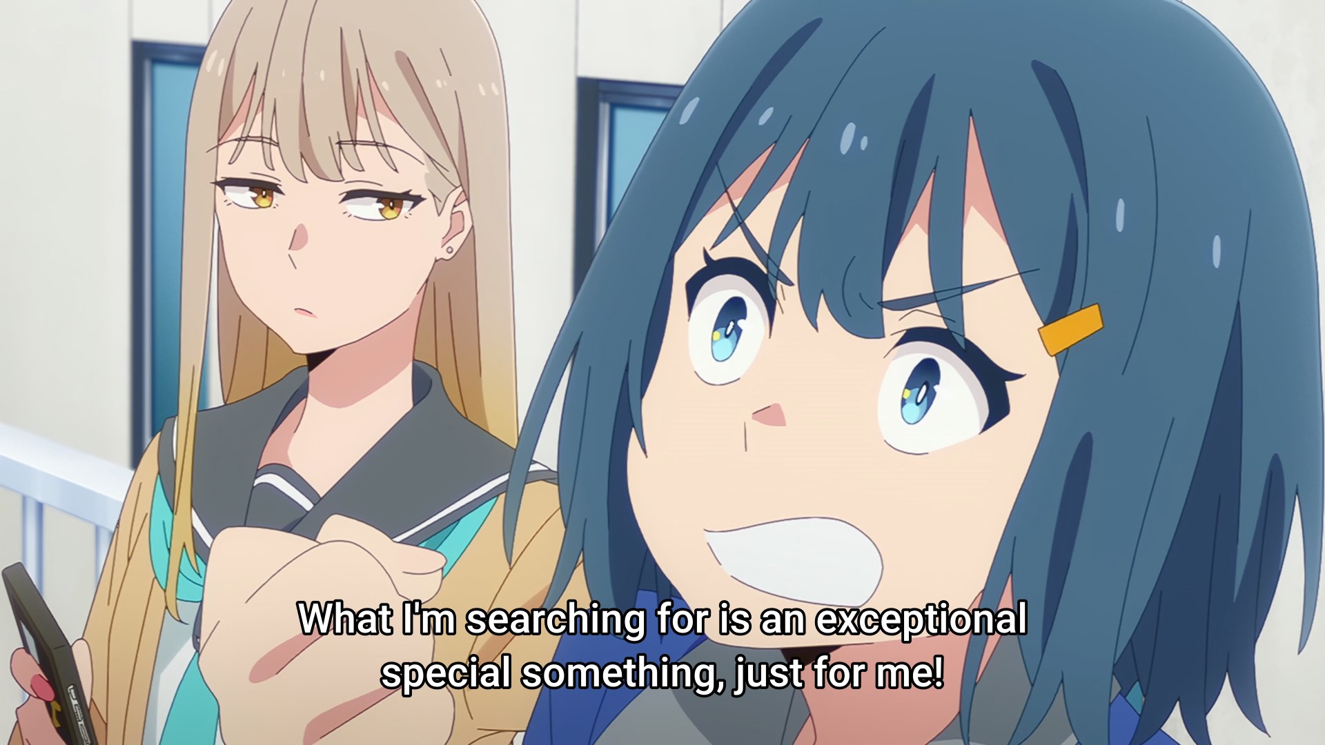
Minami declaring she is going to look for her special extraordinary something while her friend looks on bemused

An enjoyable first episode which doesn’t spent too much time yet on explaining golf to the viewer. Minami with her desire to do something special and extraordinary but failure at achieving anything is extremely relatable. The way Minami is looking for something to be obsessed with and how she thinks golf might be it, is something I recognise. I like her friend Izumi too, a good foil for her enthusiasm, as well as Akane, the golf girl we see in the video, who ends up taking Minami under her wing.

The animation is fluid and good looking in the right places, with the actual golf playing receiving the most care; it’s also not afraid to get a bit ugly and off model when necessary, like when Minami goes into one of her rants. I already liked the original OVA when it came out in 2022, which was just three high school girls playing golf and hoped it would be a series someday. So far I’m glad I got my wish.

Wat Vooraf Ging — #aComicaDay (63)

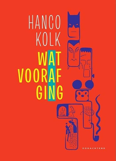
Dutch cartoonist Hanco Kolk goes into What Came Before the creation of various famous characters, from Romeo & Juliet to Batman, Mickey Mouse to Cinderella.

A red cover with the title and author on the left and stylised portraits of various famous characters on the right including Batman and Cinderella

Hanco Kolk got his first comic published in the same year I was born, 1974, in legendary underground zine Tante Leny Presenteert, when he was 17. Cutting his teeth on underground and amateur zines in the seventies, also founding his own, he moved into more commercial comics work in the 1980s, his most famous creation being Gilles de Geus, “the Dutch Asterix”, on which he worked together with Peter de Wit as scenarist. These two worked together a lot, including on an actual television course on how to become a cartoonist, as well as the still running Singles newspaper comic strip. On his own, his Meccano series of graphic novels has been critically acclaimed both in the Netherlands and France.

Wat Vooraf Ging (What Came Before) is drawn in Kolk’s usual Clear Line style and starts with Romeo and Juliet, each story linking to the next on its last page. In order, these go from Romeo and Juliet to Batman, Cinderella, Mickey Mouse, Frankenstein, Dracula and finally Sherlock Holmes. In each case a lot of other characters and stories are also talked about, showing how they influence the feature creation or were in turn inspired by them.

For the most part this is going over well known territory if you know these characters, but for me at least there were still surprises here and there. Not in the least the fact that Cinderella is a story so old it has been around in one form or another since literally the Stone Age!

Whether or not these precursors were actual influences is not always knowable of course. For example, Kolk starts his examination of Batman’s origins with Pierre Picaud, a 19th century shoemaker rather than much more obvious and later influences like Zorro. And the reason he does so was because Picaud was the real life inspiration for The Count of Monte Cristo. Picaud was betrayed by his friends, accused of being an English spy for which he was imprisoned, after which his friends took his fiancee and fortune for themselves. Once he got out of jail he took revenge and murdered them, for which he got the death penalty. From there Kolk shows the evolution of the masked avenger step by step, from the Scarlet Pimpernel all the way to Batman.

This was the last comic I bought in 2024 and the first I read this year, therefore a good one to re-open this series with.